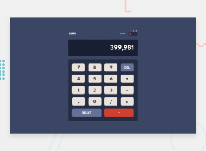
Design comparison
SolutionDesign
Solution retrospective
Please send your feedback. It is very beneficial.
Community feedback
- @sonographerPosted over 3 years ago
UI 10/10 Logic 6/10
I did not check your code but looks like you are using eval () function. This is not good practice to do so.
0@Japjotsingh02Posted over 3 years ago@sonographer thanks,for your feedback. I will surely find best way to do so and can you provide me its alternative.
1 - @A-amonPosted over 3 years ago
Hello! It's a great work~
But the buttons look compressed on mobile size. There are also tons of adding/removing classes in JS just for theme alone. I believe adding/removing only one class on the larger parent such as body should be enough in JS, and the rest of the theming can be done in CSS.
0
Please log in to post a comment
Log in with GitHubJoin our Discord community
Join thousands of Frontend Mentor community members taking the challenges, sharing resources, helping each other, and chatting about all things front-end!
Join our Discord
