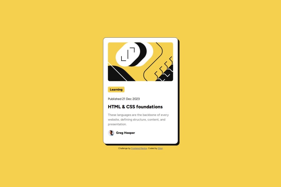
Design comparison
Solution retrospective
I am the most proud of using flexbox properly and getting my card to look as close to the original design as possible. I am also getting the hang of rem values rather than px and I want to continue on practicing those. I believe padding is still a bit of a challenge for me as this is not perfect on the project yet (particularly the bottom padding seems too big?).
What challenges did you encounter, and how did you overcome them?Rounding the corners right on the top image was a bit of a struggle since the padding and border-radius were not working together as I wanted them to, but I overcame that. The top "learning" tag also proved to be a bit tricky, but I figured it out by just getting rid of a small part of the HTML that was actually unhelpful!
What specific areas of your project would you like help with?Tips on getting the padding values as close to the design as possible are very welcome. I also want to work on organizing my code in a neater way, so if anyone has feedback on that I would love to hear!
I would also really like to work on responsiveness and mobile design more.
Community feedback
- P@JacobKnittlePosted 10 months ago
Get more familiar with figma using the alt button on the elements and it will tell you the exact padding.
0
Please log in to post a comment
Log in with GitHubJoin our Discord community
Join thousands of Frontend Mentor community members taking the challenges, sharing resources, helping each other, and chatting about all things front-end!
Join our Discord
