Submitted 6 months ago
Simple Blog Preview Card with just HTML and CSS
#accessibility

@AnggaWibawa

Design comparison
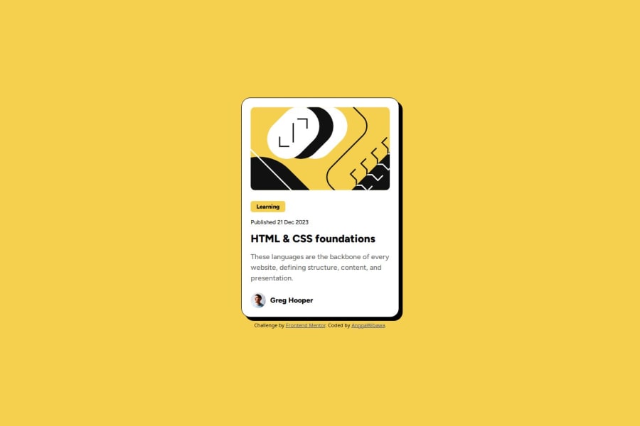
SolutionDesign

Community feedback
- P@SuneYdePosted 6 months ago
Great use of semantic elements like
<main>,<section>, andaria-labelfor accessibility. Consider using<time>for the published date for better semantics. The alt text could be simplified for conciseness. Ensure the layout scales well on mobile by adjusting font sizes and padding. The "Learning" label could look more like a button as in the original design. Overall, solid structure and accessible, just small tweaks needed!Marked as helpful1@AnggaWibawaPosted 6 months ago@SuneYde Thank you very much for the feedback, this is very useful for me in the future to improve accessibility using semantic in my project!
0

Please log in to post a comment
Log in with GitHubJoin our Discord community
Join thousands of Frontend Mentor community members taking the challenges, sharing resources, helping each other, and chatting about all things front-end!
Join our Discord