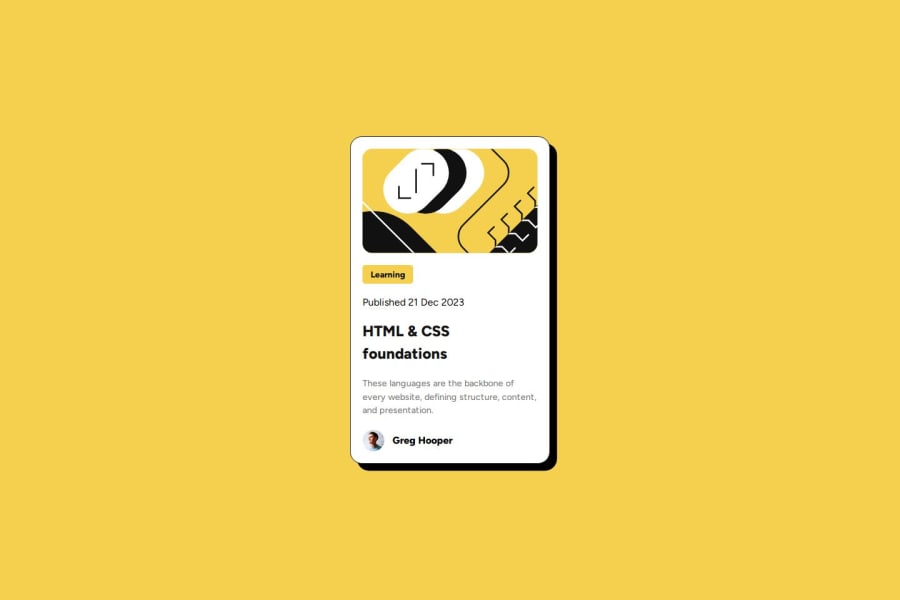
Not Found
Not Found
Not Found
Not Found
Not Found
Not Found
Not Found
Not Found
Not Found
Not Found
Not Found
Not Found
Not Found
Not Found
Not Found
Not Found
Not Found
Not Found
Not Found
Not Found

Submitted

Simple Blog preview card

Uttam Kalariaā€¢ 40

@Uttam-Patel

Desktop design screenshot for the Blog preview card coding challenge

This is a solution for...

  • HTML
  • CSS
1newbie
View challenge

Design comparison


SolutionDesign

Solution retrospective


What are you most proud of, and what would you do differently next time?

This was a beginner level challenge and I have solved it easily without any problems. But if anyone have any type of feedback then please share it on comment below.

What challenges did you encounter, and how did you overcome them?

This was a beginner level challenge and I have solved it easily without any problems.

Community feedback

Daniel šŸ›øā€¢ 44,230

@danielmrz-dev

Posted

Hello there!

Congrats on completing the challenge! āœ…

Your solution is really impressive!

I've got a couple of ideas (about how to use HTML better) that could make it even stronger:

šŸ“Œ First: Think about using <main> to wrap your main content instead of <div>.

Imagine <div> and <span> in HTML as basic containers. They're good for holding stuff, but they don't tell us much about what's inside or its purpose on the webpage.

šŸ“Œ Second: Consider using <h1> for your main title instead of <h2>.

It's more than just text size ā€” it's about structuring your content effectively:

  • The <h1> to <h6> tags are used to define HTML headings.
  • <h1> is for the most important heading.
  • <h6> is for the least important heading.
  • Stick to just one <h1> per page ā€“ it should be the main title for the whole page.
  • And don't skip heading levels ā€“ start with <h1>, then use <h2>, and so on.

These tweaks might not change how your page looks, but they'll make your HTML code clearer and help with SEO and accessibility.

Hope that's helpful!

Keep up the great work!

Marked as helpful

1
nahuejandroā€¢ 70

@nahuejandro

Posted

This code follows good accessibility and semantic practices, making it easier to understand for both developers and analysis tools.

To ensure that your layout looks good on a range of screen sizes, you should implement responsive design techniques. Here are some suggestions to improve the responsiveness of your layout:

1-Use Media Queries: Add media queries to adjust the layout for different screen sizes. This can help you optimize the design for both small and large screens.

The HTML and CSS code provided is well-structured, with clear use of sections, classes, and ids. Is readable due to its clean formatting, consistent indentation, and use of descriptive class names.

The use of CSS variables and class names like .category, .avatar, and .poster indicates a good approach towards reusability. This makes it easy to apply these styles to other elements in the project if needed. To enhance reusability further, consider creating more modular components that can be reused across different parts of the application.

2-Instead of fixed widths, use percentages or relative units (e.g., vw, vh, em, rem) to make your elements flexible.

3-You are already using flexbox, which is great for creating responsive layouts. Make sure all flexbox properties are used optimally.

4-Ensure your images scale appropriately.

Testing the layout on various devices and using browser developer tools to simulate different screen sizes will help you identify and fix any issues with responsiveness.

The solution of the project is similar to the original project, only with some changes in the widths and heights, and it would be correct.

0

Please log in to post a comment

Log in with GitHub
Discord logo

Join our Discord community

Join thousands of Frontend Mentor community members taking the challenges, sharing resources, helping each other, and chatting about all things front-end!

Join our Discord