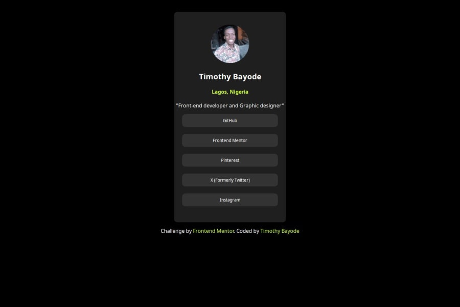
Simple and responsive social media link page using HTML and CSS
Design comparison
Solution retrospective
I am definitely open for contributions from members of the community.
Community feedback
- @justinconnellPosted about 1 year ago
Your solution looks great!
I tried to look at your code, but seems that the it's linked to your recipe solution repo ;)
I did manage to get some insight by inspecting the elements on the page with Chrome dev tools and have a couple of suggestions based on what I could see:
- I noticed that your container
divis not centred on the screen - this can be done with the following CSS:
 {
    height: 100vh;
    display: flex;
    flex-direction: column;
    justify-content: center;
    align-items: center;
}
The other suggestion is to try using semantic HTML - for example you could replace
divtags with an HTML5 tag that will provide more context and meaning to the document for screen readers and search engines - this will improve accessibility and SEO.For example you could take the following approach to include some semantic elements:
<article>
  <header>
      /* heading content here: (avatar, name, location, bio) */
  </header>
  <section>
      /* main content here: (link list) */
  </section>
</article>
Otherwise, you're doing great!
Hope you find the feedback useful...
Keep on coding!
0 - I noticed that your container
Please log in to post a comment
Log in with GitHubJoin our Discord community
Join thousands of Frontend Mentor community members taking the challenges, sharing resources, helping each other, and chatting about all things front-end!
Join our Discord
