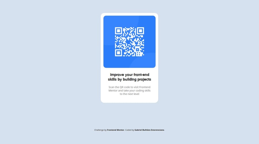
Simple and responsive QR code page with HTML and CSS
Design comparison
Community feedback
- @Islandstone89Posted 10 months ago
HTML:
-
Don't use words like "image" or "photo" in the alt text. Screen readers start announcing images with "image", so an alt text of "QR code image" would be read like this: "image, QR code image". Also, the alt text must say where it leads(frontendmentor.io).
-
Footer text must be wrapped in a
<p>.
CSS:
-
It's good practice to include a CSS Reset at the top.
-
Add around
1remofpaddingon thebody, so the card doesn't touch the edges on small screens. -
Change
heighttomin-height- this way, the content will not get cut off if it grows beneath the viewport. -
Remove
max-widthonbody, it is not needed. -
Add
justify-content: centerandalign-items: centeronbodyto center the card horizontally and vertically. -
Remove the margin on the card, it is not needed, as the centering in done as mentioned above.
-
max-widthon the card should be inrem. -
Remove the margin on the image, and change the max-width to
100%, so it doesn't spill out of its container. It is also common to give images adisplay: block. -
Since all of the text should be centered, you only need to set
text-align: centeron the body, and remove it elsewhere. The children will inherit the value.
Marked as helpful1@bulhoesgabrielPosted 10 months agoThank you for the feedback! I'm gonna remember those tips in my next projects. @Islandstone89
1 -
Please log in to post a comment
Log in with GitHubJoin our Discord community
Join thousands of Frontend Mentor community members taking the challenges, sharing resources, helping each other, and chatting about all things front-end!
Join our Discord
