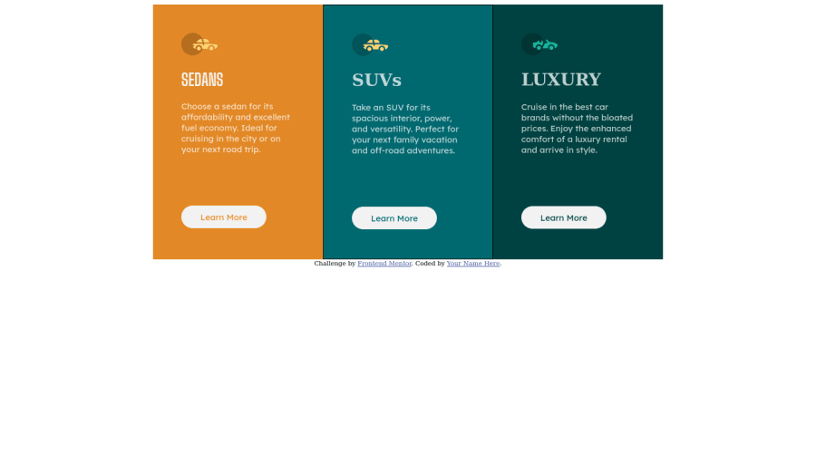
simple 3 column preview card component using HTML and CSS
Design comparison
Solution retrospective
simple 3 column preview card component using HTML and CSS.
Please let your input, advice, tips and tricks be know in this comment section and happy coding everyone!!!
Community feedback
- @HassiaiPosted almost 2 years ago
Replace<div class="cardwrapper">with the main tag and <div class="attribution"> with the footer tag to fix the accessibility issues. click here for more on web-accessibility and semantic html
Give the body a background-color, Use the colors that were given in the styleguide.md found in the zip folder you downloaded.
There is no need for a height value in the card.
To center .cardwrapper on the page, add min-height:100vh; display: flex; align-items: center: justify-content: center; or min-height:100vh; display: grid place-items: center to the body.
To center .cardwrapper on the page using flexbox:
body{
min-height: 100vh;
display: flex;
align-items: center;
justify-content: center;
}
To center .cardwrapper on the page using grid: body{ min-height: 100vh; display: grid; place-items: center; }This challenge requires a media query for the mobile design. you forgot to add a box-shadow to the design.
Use relative units like rem or em as unit for the padding, margin, width values and preferably rem for the font-size values, instead of using px which is an absolute unit. For more on CSS units Click here
Hope am helpful.
Well done for completing this challenge. HAPPY CODING
0
Please log in to post a comment
Log in with GitHubJoin our Discord community
Join thousands of Frontend Mentor community members taking the challenges, sharing resources, helping each other, and chatting about all things front-end!
Join our Discord
