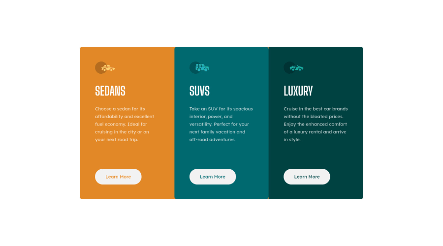
Design comparison
Solution retrospective
Howdy gang!
I just decided to quickly code this up to use as examples. I've been trying to help newer coders with some CSS advice and a lot of people pick this challenge up. I coded it up to use within my explanations to re-enforce learning.
Community feedback
- @ApplePieGiraffePosted over 3 years ago
Hey, Rafal! 👋
Your recent reply to my comment got me interested to see you'd submitted anything new yet, and I noticed you'd completed this challenge just this week! 😄 It's good to hear that you're helping others pick up CSS, once again, and this is a good example challenge to tackle! 👏
This looks great! The top of the card is getting cut off the screen in the mobile layout, though. For some odd reason, it looks like it's being caused by
height: 100vh
on thebody
. I thinkmin-height: 100vh
would work better in this case instead. 😉And you might have forgotten to add the background color from the original design to the page! 😜 It's not such a big detail, I guess, because the background color is a bit light, anyway. Once, I coded an entire Frontend Mentor challenge using my (cheap) external monitor instead of my (better-quality) laptop screen and didn't even realize there were background images in that challenge because of how washed out the colors were on my monitor! 😂
Anyway... keep going with these challenges. 👍
And, of course—keep coding (and happy coding, too)! 😁
Marked as helpful2@grizhlieCodesPosted over 3 years ago@ApplePieGiraffe Crap, whilst my monitor certainly wasn't cheap (49") I was indeed using night-mode on it so colors were somewhat missed 🙄😣
Whilst
min-height: 100vh
does indeed fix the issue it seems to be caused byplace-items: center
. Which I actually intuitively understand but can't verbalise as of yet.Pretty sure wrapping it in a div would fix this particular bug too, after moving about some width related code.
I'll play around with this logic in codepen, no clue as to why this all works like it does. Reminds me of the various flexbox lessons I came across as to how much flexbox does behind the scenes that we don't really understand.
Thanks for the useful feedback, now I have this to play with whilst throwing semantic html all over my most recent project 😄
1
Please log in to post a comment
Log in with GitHubJoin our Discord community
Join thousands of Frontend Mentor community members taking the challenges, sharing resources, helping each other, and chatting about all things front-end!
Join our Discord