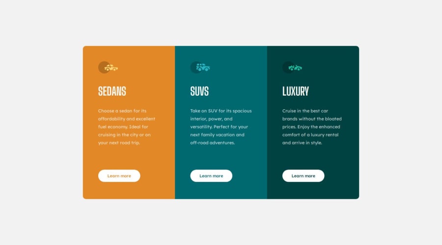
Design comparison
SolutionDesign
Solution retrospective
What are you most proud of, and what would you do differently next time?
It was finished easily :)
What challenges did you encounter, and how did you overcome them?No challenges I think
What specific areas of your project would you like help with?Nope, I don't really but if you can't, please feel free to give any solutions!
Community feedback
- @0xabdulkhaliqPosted 7 months ago
Hello there 👋. Congratulations on successfully completing the challenge! 🎉
- I have a suggestion regarding your code that I believe will be of great interest to you.
CSS 🎨:
- The
buttonelements needs to have ahoverstate with transparent background, actually we can handle that issue with a css color function namedrgba()
- The
rgba()function define colors using the Red-green-blue-alpha (RGBA) model. RGBA color values are an extension of RGB color values with an alpha channel, which helps us to take control over the opacity of the color.
- So just add
rgba(0,0,0,0)for thebuttonelements duringhover
- Let's look an example
button:hover {
  background: rgba(0,0,0,0);
  color: white;
  outline: 1px solid white;
  transform: scale(1.02);
}
- Additionally, I want to address the duplication of rules which you've been applied for
buttonelements. Currently this is your rules for them,
.button-1{
    padding: 12px 30px 12px 30px;
    border-radius: 20px;
    border: none;
    background-color: white;
    color: var(--Bright-orange);
    font-family: "Lexend Deca";
    font-weight: 500;
    cursor: pointer;
    transition: all 0.2s ease-in-out;
    justify-content: flex-end;
    margin-top: 60px;
}

.button-2{
    padding: 12px 30px 12px 30px;
    border-radius: 20px;
    ....      // Same rules
}

.button-3{
    padding: 12px 30px 12px 30px;
    border-radius: 20px;
    .....    // Same rules
}
- We don't need this much of duplication in our code, this will result in poor result when it comes to web performance!
- Here's the refactored style rules
button {
    padding: 12px 30px 12px 30px;
    border-radius: 20px;
    border: none;
    background: white;
    font-family: "Lexend Deca";
    font-weight: 500;
    cursor: pointer;
    transition: all 0.2s ease-in-out;
    justify-content: flex-end;
    margin-top: 60px;
}

.button-1 {
   color: var(--Bright-orange);
}
.button-2 {
   color: var(--Dark-cyan);
}
.button-3 {
   color: var(--Very--dark-cyan);
}
- In the above rules, we selected all
buttonelements to apply general button styles and then we added the classes you've added in markup for modifying likebutton-1,button-2and so on to apply unique colors for each of them without duplicating entire styles.
- Now you have gotten the desired result for hovering without hassling in an efficient way.
- Pro tip: you can use
transparentvalue forbackgroundproperty to get the same effect asrgba(0,0,0,0)but usingrgbaprovides more granular control over the color correction.
- If you have any questions or need further clarification, you can always check out
my submissionfor this challenge where i used this technique and feel free to reach out to me.
.
I hope you find this helpful 😄 Above all, the solution you submitted is great !
Happy coding!
Marked as helpful1@JamesWallison1Posted 7 months ago@0xabdulkhalid Yes I have thought about shortening that part but still haven't figured it our how to shorten it and you helped me a lot! Thank you really much!
0
Please log in to post a comment
Log in with GitHubJoin our Discord community
Join thousands of Frontend Mentor community members taking the challenges, sharing resources, helping each other, and chatting about all things front-end!
Join our Discord
