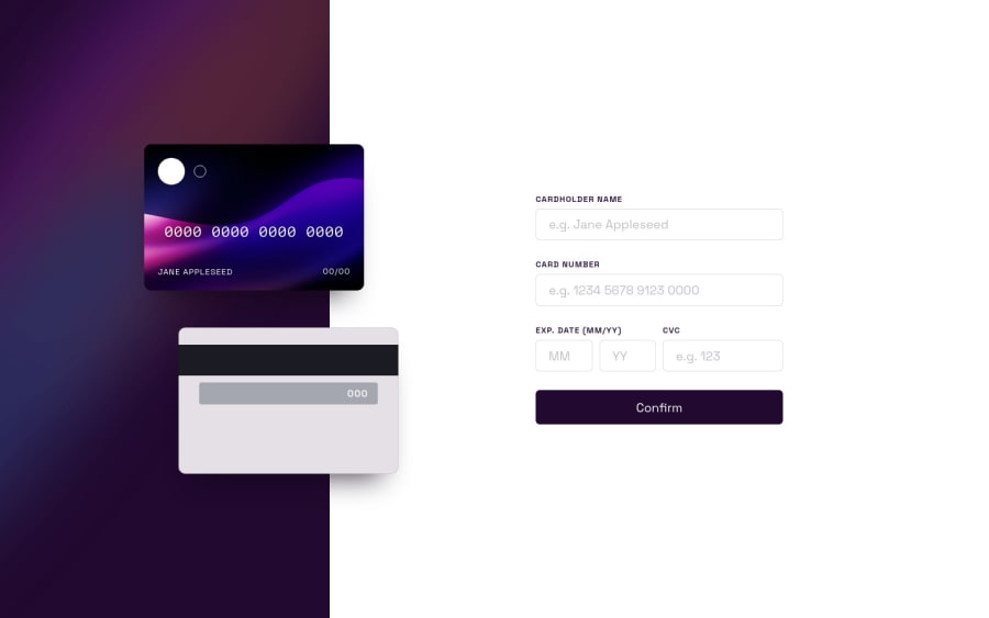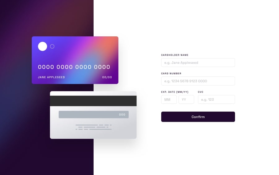
Design comparison
Solution retrospective
I didn't follow the design completely as the card display was a little un-ideal for my liking (un-realistic aspect ratio).
I'm quite happy with the Mobile view especially!
I also wanted to incorporate some extra features such as animation and card disaply changing when using a Mastercard / Visa / Amex card. (try entering a card begining with 4/5).
Vue really made the reactivity simple.
Community feedback
- @elaineleungPosted over 2 years ago
Hi Simon, just wanted to say this is amazing, and what a great job 😊
I don't have any feedback or suggestions, but I did notice the issues in your report, so I just wanted to make sure you take a look at them, and most of them are fairly straightforward to fix.
Awesome work, looking forward to more!
Marked as helpful1@simeydotmePosted over 2 years ago@elaineleung thank you Elaine! Appreciate the feedback!
Yes I noticed all the issues, looks like some things introduced when bundled from Vue related to props being passed into custom elements 🤔 not sure how to approach that!
Can easily resolve the alt attributes 😊
1
Please log in to post a comment
Log in with GitHubJoin our Discord community
Join thousands of Frontend Mentor community members taking the challenges, sharing resources, helping each other, and chatting about all things front-end!
Join our Discord
