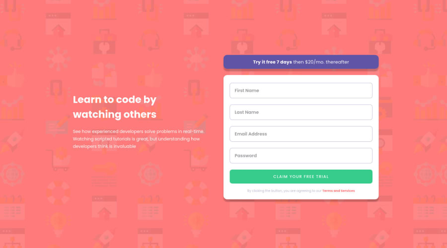
Sign-up-Form, with HTML, CSS, JS, Mobile First, and Flex-Box.
Design comparison
Solution retrospective
If anyone has any feedback, I would be grateful.
Community feedback
- @SheGeeksPosted over 3 years ago
Great work here Lucas!
I second Rayane's suggestions and would add adjusting your character spacing on the button so that the letters aren't so spread out. You can use decimal values instead of whole numbers if that helps (i.e.
.1ch
).Some of your HTML and accessibility issues from the report can be reduced by switching the
section
to adiv
or by adding a visually hidden heading tosection
. As noted in the accessibility area, usingaria-label
attributes on your inputs would take care of the lack of labels neccesary for those who need assistance browsing the web. Take some time to look into web form accessibility to get a better understanding of why you're getting these particular errors and how other options to resolve them. There are easy solutions to implement without changing your code.Your form validation is great! The only thing I would suggest adding is to also validate when someone tries to submit an empty form. If I do this on your solution, no error messages appear, though they should.
Last thing, you added an outline to the inputs to signify when someone is entering information. However, the challenge also requests that outline be applied to the hover states of all interactive elements. You have a hover state for your button. I'd add one for the input fields too and use the same styles that you have for active input fields.
Again, great work and really impressed with your form validation!
2@Lusk1nhaPosted over 3 years ago@SheGeeks Thank you for your tips and to share your knowledge.
0 - @RayaneBengaouiPosted over 3 years ago
Hello Lucas Pedro,
Congrats for completing the challenge ! 🙂
It looks pretty close the the final design, I would just add more padding on your trial-text and trial-form elements. Also, make your h1 and p bigger.
Overall, well done for the challenge and happy coding ! 😃
1@Lusk1nhaPosted over 3 years agoThanks, I will be going adjust my project with your tips. 😃
0
Please log in to post a comment
Log in with GitHubJoin our Discord community
Join thousands of Frontend Mentor community members taking the challenges, sharing resources, helping each other, and chatting about all things front-end!
Join our Discord