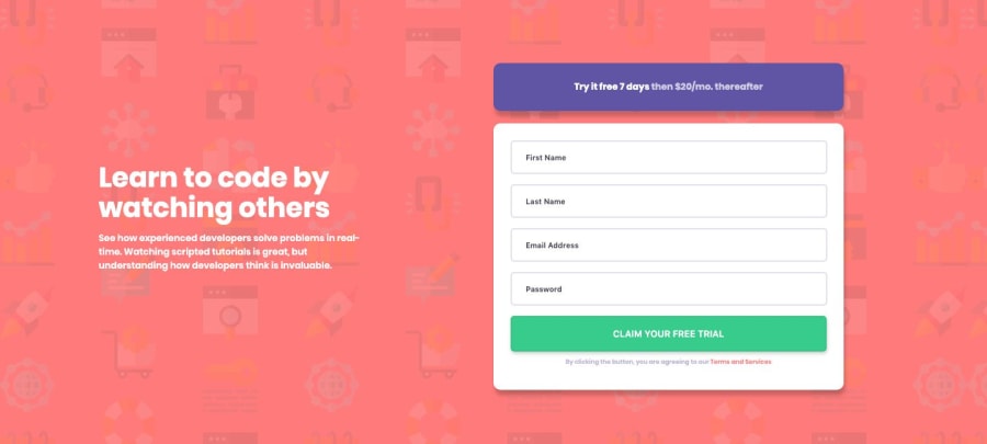
Design comparison
Community feedback
- @declanslevinPosted almost 5 years ago
Hi Prem,
This looks really good!
I did notice though that your page responsiveness breaks between 400px and 1050px. I think partly this is because you have fixed widths on your form elements - I would suggest using max-widths instead. Alternatively you could use a percentage width on the parent container and set all the child elements to be 100% width.
It's also a bit odd that you have nested everything inside the
<header>element. You probably don't even need the<header>element because there is no obvious header on the page design.I recommend you take some time to fix the issues highlighted in your site report. Otherwise, great job!
2@prem1835Posted almost 5 years ago@declanslevin thank you I appreciate your feedback and as a beginner in front end development i am making lots of mistakes. Thank you for your advice surely i will work on it.
0
Please log in to post a comment
Log in with GitHubJoin our Discord community
Join thousands of Frontend Mentor community members taking the challenges, sharing resources, helping each other, and chatting about all things front-end!
Join our Discord
