Design comparison
SolutionDesign
Community feedback
- @mattstuddertPosted about 5 years ago
Nice work on this challenge! 👍
Here is some feedback after taking a look at your code:
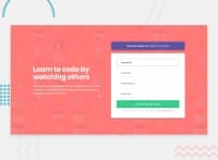
inputelements need to either be paired with alabelelement or they need to have anaria-labelattribute added to them. This is so that people using screen readers will know what the form fields are for.- I would recommend not using IDs as CSS selectors. They are too specific and cannot be reused on the page. Classes are a better option.
- I'd add another media query at a larger screen size than
375px. The content doesn't currently fit the screen at376pxup to small tablet size.
I hope these tips help. Keep up the great work! 🙂
0
Please log in to post a comment
Log in with GitHubJoin our Discord community
Join thousands of Frontend Mentor community members taking the challenges, sharing resources, helping each other, and chatting about all things front-end!
Join our Discord

