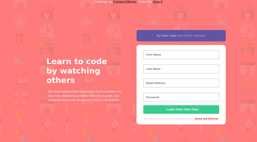
Design comparison
Solution retrospective
any feedback or suggestion would be awesome :)
Community feedback
- @vanzasetiaPosted over 1 year ago
Hello, Atlas K! 👋
You should not position your attribution at the top of the main content. Also, it can not be a
<header>
of the page.<header>
should be used to wrap content like logo and navigation links. You should use<footer>
instead.Your attribution should go below the main content. In other words, it should be after the
<main>
landmark.I don't think "Try it free 7 days then $20/mo. thereafter" is a
<button>
. For me, it is just a banner above the form for promotion.Each
<input>
must have a label or accessible name. Since there is no visible label on the design, I recommend usingaria-label
to label each input.Use CSS to uppercase the text. Screen readers might spell the uppercased word in the HTML (spelled letter by letter).
<input>
withtype="submit"
is a legacy element. It was used before the<button>
element exist. It is best to avoid using legacy elements. So, use<button>
element instead.I recommend trying to create custom form validation with JavaScript. If you try it you can learn more about JavaScript. Also, I recommend using
const
orlet
instead ofvar
.Learn how to create custom form validation — How To Create Accessible Form with Boring Design? - CodeNewbie Community 🌱
I hope you find this useful. Happy coding! 😄
Marked as helpful1
Please log in to post a comment
Log in with GitHubJoin our Discord community
Join thousands of Frontend Mentor community members taking the challenges, sharing resources, helping each other, and chatting about all things front-end!
Join our Discord