
Sign-up Page With CSS Animations And CSS-Only Form Validation

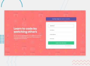
Design comparison

Solution retrospective
Hey, everybody! 👋
This was a fun challenge which I actually quite enjoyed! 😀
I was able to match the desktop and mobile designs rather closely and only had to use one media query to make the page responsive (and managed to keep my code from turning into a mess), so I was quite happy with that! 😄
I decided to go with CSS-only form validation again, and this time, I let the browser handle the actual error messages and just focused on the validation icons (I added an extra green checkmark to make things look nice).
And, of course, I added some CSS animations from Animate.css to finish things off! 😉
Once again, feedback on both my design and code is welcome and appreciated! 😊
Happy coding! 😁
Community feedback
Please log in to post a comment
Log in with GitHubJoin our Discord community
Join thousands of Frontend Mentor community members taking the challenges, sharing resources, helping each other, and chatting about all things front-end!
Join our Discord