

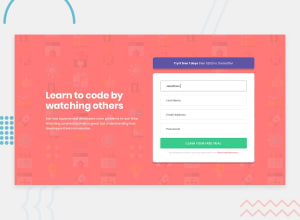
Design comparison

Community feedback
- @LfrancosPosted almost 3 years ago
Hi Alex!
This is looking really nice!
I only have one comment and it is about the responsiveness of the site. Both the mobile and the desktop versions look really nice, but if you play around with the width of the screen you will see that there are point where the design brakes and and is hard to understand an read. I would recommend to see where is the optimal place to make the media query. Looking at your site I feel like the best place to make the brake is 1100px. That is going to make it stretch your main element a lot when it is below 1100px, but you can add a "max-width" to your main element. You can decide based on your taste what is the max-width that element.
Hopefully this makes sense and is helpful :)
Marked as helpful1@AlexNixxPosted almost 3 years ago@Lfrancos Hi)) Yeah! U right, i know about this issue. I just work with simple state media query like laptop 1024px and tablet 768px ) Max-width can elegant fix this) Tnx!
0

Please log in to post a comment
Log in with GitHub
Join our Discord community
Join thousands of Frontend Mentor community members taking the challenges, sharing resources, helping each other, and chatting about all things front-end!
Join our Discord