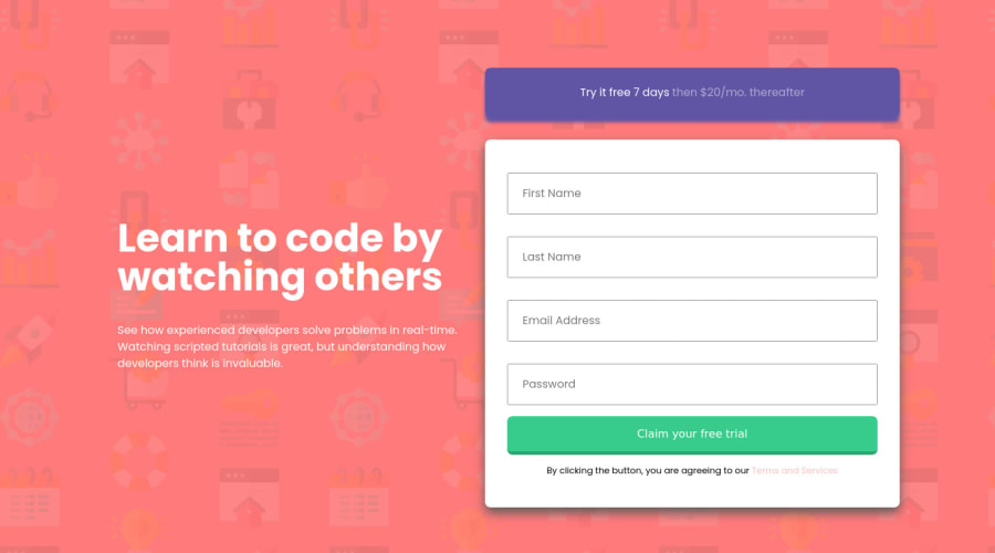
sign-up form with no media query full responsive flexbox
Design comparison
Solution retrospective
Hi, guys just completed this project please provide any feedback.
Community feedback
- @pikapikamartPosted about 3 years ago
Hey, awesome work on this one. The desktop layout looks great, just the overall layout is big bigger compared on the design. The site is responsive and the mobile state looks fine, though it could use smaller
font-sizefor the mobile state since the heading text is quite big right now and some components as well.For some other suggestions, here are some:
- Heading tags doesn't need to use
font-weight: 700since by default it is already bold ( 700 ). - Since it has a form-component, it would be nice to use
formtag for the.inputselector instead ofdivso that it will be clear on the markup. - Your
inputright now currently lacks associatedlabelto it or anaria-labelto which will define the purpose of theinputelement. Always include it so that user will know what they need to give on eachinput. Make sure thatlabelis pointing to theidof theinputas well. - When submitting an invalid form, I suggest making the error-messages stays present until the user submits again the form, because right now it is hiding the error-messages after a couple of seconds and a user might not be fast enough to read those error-messages.
- Also, those error-messages are only seen visually but not really linked to their respective
inputtag. A proper way of adding those errors would look something like this:
if ( input is wrong )
  input.setAttribute("aria-invalid", "true");
  input.setAttribute("aria-describedBy", id of the error-message);
else
  input.removeAttribute("aria-invalid");
  input.removeAttribute("aria-describedBy");
The error-message element should have an
idattribute which is referenced by thearia-describedByattribute on theinputelement. By doing that, your user will know that the input is wrong because ofaria-invalidand they will know what kind of error they made because of thearia-describedBy.- Those error-icons are only decorative images. Decorative images are just images that doesn't contribute to the overall content of the site. They should be hidden for screen-reader at all times by using
alt=""andaria-hidden="true"to theimgtag. - Another idea to implement is to have an
aria-liveelement that will announce if the form submission is valid or not. This way, the user will be informed right away on what is the status of their submission. - If you like, you can have a look at this simple accessible form snippet that I have. Let me know if you have any queries about this one.
- Those
terms and servicesshould be acting as link since on a real site, they are interactive so that user can see those information on another page. Use anatag for that text. - Lastly, just about the layout for mobile state, reducing some
font-sizeand just making the layout a bit smaller:>
Aside from those, great job again on this one.
Marked as helpful0 - Heading tags doesn't need to use
- P@brodiewebdtPosted about 3 years ago
Nice job. Layout looks good. The form validates. No issues in the report. Well done.
Marked as helpful0
Please log in to post a comment
Log in with GitHubJoin our Discord community
Join thousands of Frontend Mentor community members taking the challenges, sharing resources, helping each other, and chatting about all things front-end!
Join our Discord
