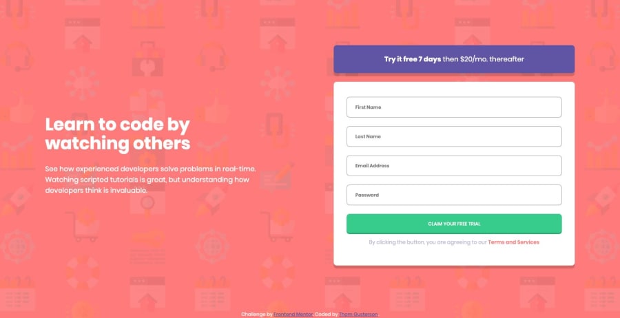
Design comparison
SolutionDesign
Community feedback
- @mattstuddertPosted about 5 years ago
Awesome work on this challenge and it's great to see you post another solution! 👍
Regarding the labels, I would recommend not having the error text inside of them. Instead, I'd have the text for the corresponding
input, such as "First Name", so that people using screen readers know what the form field is for.The error text could then be put inside either a
divor ap, using therole="alert"attribute to alert screen reader users of an error when it happens.Let me know if you have any questions. Keep up the great work!
0
Please log in to post a comment
Log in with GitHubJoin our Discord community
Join thousands of Frontend Mentor community members taking the challenges, sharing resources, helping each other, and chatting about all things front-end!
Join our Discord
