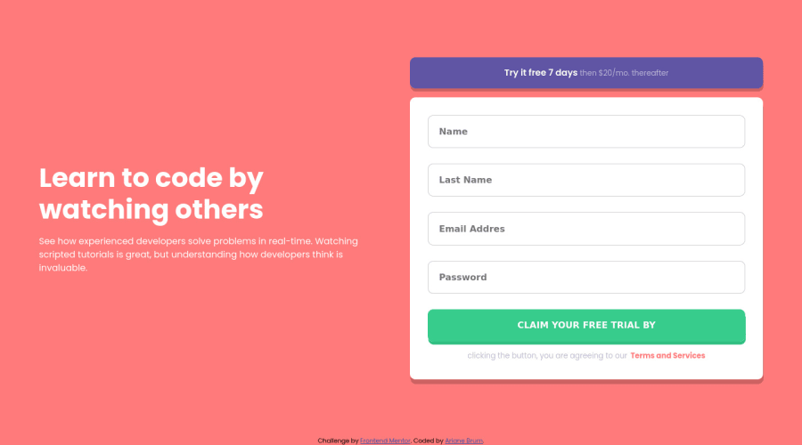
Sign-up form using CSS Grid, Flexbox, HTML5 and JS.
Design comparison
Solution retrospective
Please provide feedback, so i can do better in the future, thank you.
Community feedback
- @arbaivPosted almost 3 years ago
Hi, Ariane 👋. Amazing work. Once you submit the form with the input fields empty, it shows an error as expected 👍. Then when you enter text into the input field and focus out from it, the error message still shows. And it doesn't go away until you hit the submit button again. It's okay, not a big deal, but it's not good for the UX.
You can improve that by adding a blur event to the input element that will check: if the input value is available then remove the error message.
Marked as helpful1@Ariane-BrumPosted almost 3 years ago@arbaiv Thank you for your feedback :). I made some adjustments.
0
Please log in to post a comment
Log in with GitHubJoin our Discord community
Join thousands of Frontend Mentor community members taking the challenges, sharing resources, helping each other, and chatting about all things front-end!
Join our Discord
