Design comparison
SolutionDesign
Community feedback
- @abhu-A-JPosted over 4 years ago
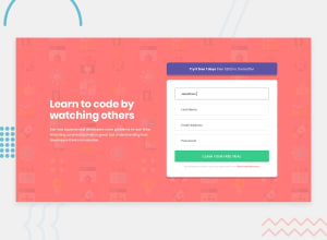
@VMuthulakshmi welcome to the community. I think you should check out the following once again to get a much closer match to the UI:
On the form itself:
- I think to expand all input group to a width of 100% so it occupies the same width as the submit button.
- You can reduce the padding inside the purple-colored toast component.
- The heading if matched to the same font family should make it look more appealing.
0@VMuthulakshmiPosted over 4 years ago@abhu-A-J Thank you,i will work on your suggestions
0
Please log in to post a comment
Log in with GitHubJoin our Discord community
Join thousands of Frontend Mentor community members taking the challenges, sharing resources, helping each other, and chatting about all things front-end!
Join our Discord
