


Design comparison


Solution retrospective
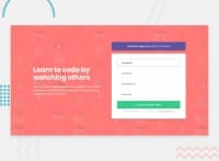
Day 4 of 1 challenge a day:
Challenge 4: Holy cow this was a step up in challenge (pun intended) for me!
For a newbie challenge, this really forced me to research a lot and look for how to solve this.
In terms of CSS, I felt that it was pretty straightforward, though one particular issue I had was when converting the mobile site to desktop view, the positioning of the my containers wouldn't be centered in the screen. I remedied this by adding padding to one of the two columns. It's not an ideal solution, but it did its part. If someone knows a better solution to this, please let me know.
Now the biggest challenge for me was the Javascript. I had very little experience with JS, but after this challenge I think I'm much more knowledgeable about it. That being said, this was really rough in the beginning as I had to search through tons of sites and try to piece together what I needed. I'm sure people could've accomplished this with using other resources, but I went in using only pure JS and CSS. My JS seems rather bloated, but I hope to rectify this in due time.
My questions to the community are how did you learn JS and what are your recommendations for understanding it easier?
Community feedback
Please log in to post a comment
Log in with GitHub
Join our Discord community
Join thousands of Frontend Mentor community members taking the challenges, sharing resources, helping each other, and chatting about all things front-end!
Join our Discord