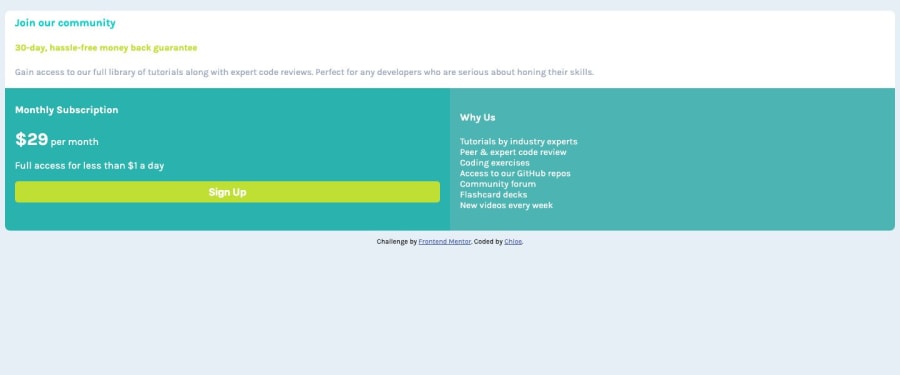
Design comparison
Solution retrospective
Refreshing my knowledge of flexbox if anyone has any suggsetions happy to hear them as I started with the mobile view before adding min-width media queries for desktop.
Community feedback
- @AlexBueckigPosted about 5 years ago
Hi Chloe,
your current workflow with starting with the mobile view first is great, it's the preferred way of coding websites nowadays.
First of all, your project scales great across both mobile and desktop. I noticed you put a
display: flex;
on your body withflex-direction: column;
. But since the flex-items (main and footer tag in your case) are alreay block level elements there is no use in adding these properties to the body. Block level elements will already be aligned in columns by default and since you are not using the justify/alignment options flexbox provides you don't really need it. It's not breaking anything though so it really doesn't matter, its just a tip to keep your codebase as small as possible. 😉Another thing you could change to make your solution look closer to the actual design is to increase the padding on your 3 elements - I saw you added different paddings to the different containers, a single padding for all 3 of them would make it look more consistent. Another minor, but design-wise important change, is to give your whole container a border-radius to make the corners look more roundish. You might even set a
max-width: 700px;
on it to stop it from getting too wide. But thats just personal preference.Also another thing that is really important to make your button look more interactive is to simply add a
cursor: pointer;
to it. It's a nice addition to your already existing hover effect. Another minor thing I'd change is to just add aborder: none;
to your button to make the default border disappear and you are good to go! 😃Keep up with the good work! 😇
1@cguttwebPosted about 5 years ago@AlexBueckig Thanks for the reply good points around flex I forgot to remove it and I always forget cursor: pointer have now added thanks for the reminder.
0
Please log in to post a comment
Log in with GitHubJoin our Discord community
Join thousands of Frontend Mentor community members taking the challenges, sharing resources, helping each other, and chatting about all things front-end!
Join our Discord