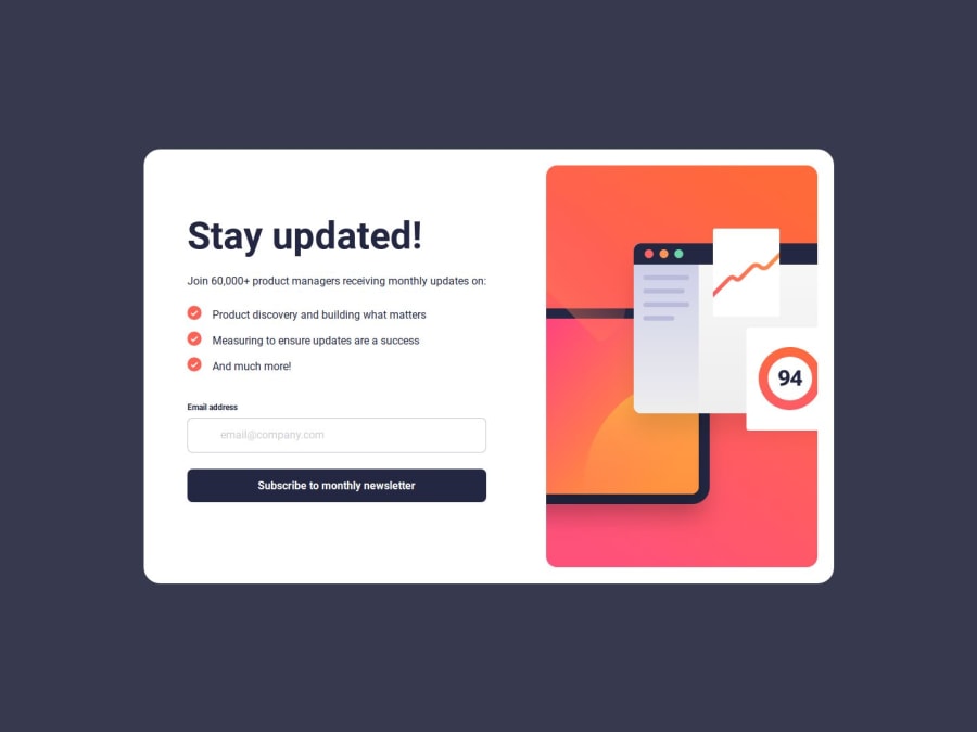


Design comparison

Community feedback
- @ZxjklpPosted 3 months ago
Great work on this project! Here are a few suggestions:
- Prevent default form submission and refreshing the page.
submitBtn.addEventListener("click", (event) => { event.preventDefault(); ... });- To ensure that the entire content is visible on mobile devices, you can make an adjustment to your CSS.
.main { min-height: 100vh; ... }- Add a function to check if the email format is valid.
...
const errorSpan = document.querySelector(".error");

function validateEmail(email) {
  const regex = /^[^\s@]+@[^\s@]+\.[^\s@]+$/;
  return regex.test(email);
}

// removes error message when typing
email.addEventListener("input", () => {
  errorSpan.style.display = "none";
});

submitBtn.addEventListener("click", (event) => {
  event.preventDefault();
  const emailValue = email.value.trim();
  if (validateEmail(emailValue)) {
    thanksSection.toggleAttribute("data-hidden");
    mainSection.toggleAttribute("data-hidden");
    document.getElementById("span").innerHTML = emailValue;
    errorSpan.style.display = "none";
  } else {
    errorSpan.style.display = "block";
  }
});
...
Marked as helpful0 - @BunchydoPosted 3 months ago
Hi SydsBike
Form Validation: The form validation currently doesn't trigger an email request when clicking the button. I would suggest adding proper validation checks and error messages for better functionality.
Semantic HTML: The structure is solid, but adding more accessible labels and aria attributes, like aria-describedby for error messages, would improve accessibility. Also, ensure all <img> tags have descriptive alt text for better screen reader support.
Accessibility: You've handled focus styles and error message visibility well. Consider linking the error message to the input field with aria-describedby. This helps screen readers understand the context better.
Responsiveness: Great use of media queries for layout adjustments across screen sizes. Testing on more devices might help fine-tune mobile-specific font sizes or element spacing.
Code Structure and Readability: Your CSS is well-organized with clear utility classes. For JS, separating DOM manipulation (like toggling hidden classes) into smaller, reusable functions will improve maintainability.
Design Fidelity: The design closely matches the mockups, but minor tweaks in spacing and alignment, especially on smaller screens, would make the layout even smoother.
Great work overall, SydsBike! Keep it up!
Marked as helpful0


Please log in to post a comment
Log in with GitHubJoin our Discord community
Join thousands of Frontend Mentor community members taking the challenges, sharing resources, helping each other, and chatting about all things front-end!
Join our Discord