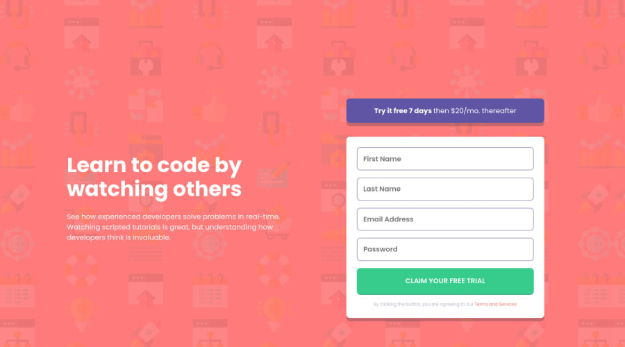
Design comparison
Solution retrospective
Hi,
I have a few question and would like to get feedback for the same.
- How does my version compare visually with the design? Can I improve the visuals? How?
- I designed it with a mobile first approach, is it the right way?
- I used css ID to select individual input values in the form, is there any better alternative available?
- Looking at my code, is there any better way to organize it?
- Any comments on the JS code and suggessions to improve?
Thanks!
Community feedback
- @pikapikamartPosted about 3 years ago
Hey, awesome work on this one. Layout in desktop seems fine but it is not properly centered like on the design. It is somehow responsive and the mobile state seems fine as well.
- I think it is fine for now but it needs to be centered properly in y-axis also the form is shorter in terms of width.
- Yep, mobile first approach always^^
- I haven't seen a usage of
id
on your css though, are you referring to actualinput
as selector? Well I this as well but it is contained to a parent container so that it won't affect other elements. - I don't really go with seeing the whole code of solutions, maybe others can see this and help with it^^.
- Suggestions, yes:
- When wrapping a text-content do not just use
div, small
to wrap it, use meaningful element like ap
tag if it just a regular text or heading tag if it is an heading. - Your
input
tag lacks an associatedlabel
tag on it. Since there are visible-label, thelabel
would be a screen-reader only label, meaning it would make user of likesr-only
class. The text-content should describe what theinput
needs like the value on theplaceholder
. - Another workaround if you don't want to use sr-only
label
, usearia-label
attribute on theinput
. - Right now, the error is just being seen visually and not really associated to the
input
. A pseudocode of a proper error looks like this:
if ( input is wrong ) input.setAttribute("aria-invalid", "true"); input.setAttribute("aria-describedBy", id of the error-message); else input.removeAttribute("aria-invalid"); input.removeAttribute("aria-describedBy");
The error-message element should have an
id
attribute which is referenced by thearia-describedBy
attribute on theinput
element. By doing that, your user will know that theinput
is wrong because ofaria-invalid
and they will know what kind of error they made because of thearia-describedBy
- Also, another idea to implement is an
aria-live
element that will announce if the form submission is a success or not. This way users will be informed right away the result of the form. - If you are confused on what I suggested, have a look at this simple snippet of mine using those method. If you have question about this, you can always reply to this comment and I can help with it.
- If you remove the
outline
property of an element, make sure to add another custom visual indicator on the element's:focus-visible
state. Try using tab on your keyboard to navigate the site, you will have a hard time since there is no indication on where you at.
Aside from those, great job again on this one.
Marked as helpful0@OmKakatkarPosted about 3 years ago@pikamart Thank you for taking the time to provide such a detailed feedback.
- I will work to center it.
- I will keep the Mobile First approach in the future designs as well then.
- I may not have been clear, I wanted to say that I used id on each input element to extract their values through Javascript. Should have I gone with another approach, like I read about the Form Data Web API but couldn't wrap my head around it. It basically was saying it returns an object with the values of the inputs
- No issues with not going through the code.
- I read your suggestions band will certainly keep the accessibility and semantics in mind. I do have a question though. As I am getting visual output, I can see that there's some error while entering the data which is shown on the screen. But how do I know what other users like visually impaired ones experience when they visit the site. Is there any tool which you can direct me to where I can get the same experience?
About the last point, I had added a different color to the border for focus and non focused states. And it is working with tabs as well. So, I didn't follow this point. But I'll explore the focus-visible state nonetheless.
Thanks for your motivating words. Have a great day!
0@pikapikamartPosted about 3 years ago@OmKakatkar Hey, great that you find the feedback useful^^
For the
id
of theinput
, like what you said using the form to target theinput
is really great and I always use this since it is more easy to handle.<form> <input type="text" name="firstname" id="firstname" aria-label="..." /> </form>
So that is my sample form, using the
name
attribute of theinput
I could just do this:const handleFormSubmission = event => { const { firstname } = event.target; .... ...... } form.addEventListener("submit", handleFormSubmission);
You can use that to get the different
input
inside theform
which is super easy and faster since you won't have to query and make the code traverse nodes in the dom tree.Well, maybe it's time for you to use your mobile phone to test, so whatever phone you are using, there is an screen-reader , on my phone it is talkback, which is located in the
accessibility
options.Or download
nvda
on your end. This is a screen-reader for desktop, though you might find it hard to use at first as it should be.0@OmKakatkarPosted about 3 years ago@pikamart Thanks for the feedback again. I will look up the screen reader. The form submit listener is new to me. Going to explore it as well.
1
Please log in to post a comment
Log in with GitHubJoin our Discord community
Join thousands of Frontend Mentor community members taking the challenges, sharing resources, helping each other, and chatting about all things front-end!
Join our Discord