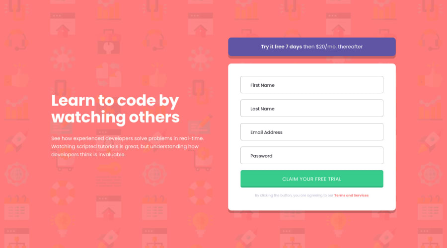
Sign up Form - Vanilla JS - Personal Additions and Animations
Design comparison
Solution retrospective
Thank you for checking out my challenge!
I learned quite a few things the past 2 months where I finally started learning JavaScript, so this is my very first JS project, be kind!
I actually remade this challenge three times! The first time I was struggling a lot, and there were quite a few bugs, then I gave up and started studying more, tried again, still struggled.. Then I started again yesterday and everything just clicked! Third time is a charm
CUSTOM DESGIN - My personal additions:
- I added a few new error messages for when a special character is used inside Name and Last Name.
- I learned and used regex in order to make the validation form for the Name, Last Name and Email.
- I added an eye icon when you type in the password so that you can see what you typed if you click on it.
- I added a small animation to the placeholder when you click in the input field, and because of that I removed the "email@example/com" that the design asked for.
Any and all feedback is welcome, thanks!
Community feedback
Please log in to post a comment
Log in with GitHubJoin our Discord community
Join thousands of Frontend Mentor community members taking the challenges, sharing resources, helping each other, and chatting about all things front-end!
Join our Discord
