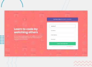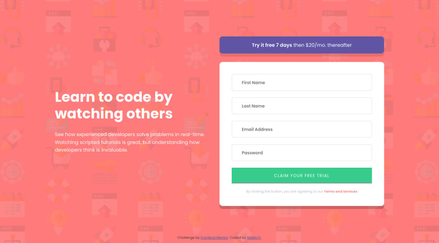
Design comparison
Solution retrospective
Nothing to be proud of. Huge difficulty with inputs and error messages, and still I'm sure my version is farm from the good one. And I also didn't add the regex for email input
Community feedback
- @md5daltonPosted about 2 years ago
Hello NadiaFr 👋
Congratulations on finishing this challenge 👍
You might have noticed that when a user moves out of focus on an input element the placeholder disappears and this might be frustrating for a user since your input elements don't have any labels so this may be a terrible user experience.
This is because you added an event listener
onfocus="this.placeholder=''"
to remove the placeholder when the input is in focus. I'd suggest you remove this event listener from your input elements since it's unnecessary.Happy coding 👌
Marked as helpful1 - @Yellow-MayPosted about 2 years ago
A good way to improve responsive designs, is to work with a mobile first design flow; design for mobile first the adjust the design for larger screen sizes. Aside from your work not being responsive, you can also use the reports as a standard to handling HTML semantics, validations and accessibilities.
Marked as helpful1@NadiaFrShLmPosted about 2 years ago@Yellow-May Thanks for your comment!
May I ask your why do you think that my version is not responsive? That bothers me from the first challenge.
We have instructions that it should looks like at the design images with 2 width (1440 and 375px). So every chalange I focus on these 2 width. Isn't it responsive?
Or probably I should give @media (max-width:) for about 500px, just to make the transitions more smooth? Or add much more max-width points?
1@Yellow-MayPosted about 2 years ago@NadiaFrShLm I actually faced a similar issue when I started out with some challenges, but I was later told that it would be better to work on making the challenge itself responsive rather than focusing on just the 2 required screen sizes.
You can think of a challenge as your personal work, so would it not be better to have a fully responsive page than just it being responsive for 2 screen sizes?
There is no harm in being creative in these challenges, you can make any modifications you feel necessary, use any tools you feel is needed, use any technology as well. Don't limit making your finished work the best because of the instructions. If you feel the page breaks at a certain point, you can start your mobile UI from that point and vice versa.
I hope this helps.
1
Please log in to post a comment
Log in with GitHubJoin our Discord community
Join thousands of Frontend Mentor community members taking the challenges, sharing resources, helping each other, and chatting about all things front-end!
Join our Discord