

Design comparison
SolutionDesign

Solution retrospective
Would love feedback on simplifying my form submission logic for checking if input fields are valid. It's very repetitive and I'm not too fond of it.
Community feedback
- @BlackpachamamePosted 11 months ago
Greetings! you have done a great job 😎
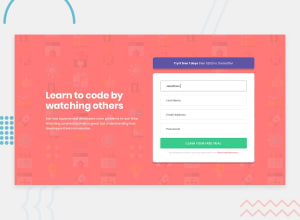
📌 Some suggestions
- The "Try it free 7 days" block looks wider than the form. At least on a 1440px screen
- Use
min-heightandmax-width, this will help the content stretch or shrink if you need to. Unlikeheightandwidthwhich can cause your content to be cut off on certain screens
Marked as helpful1

Please log in to post a comment
Log in with GitHubJoin our Discord community
Join thousands of Frontend Mentor community members taking the challenges, sharing resources, helping each other, and chatting about all things front-end!
Join our Discord