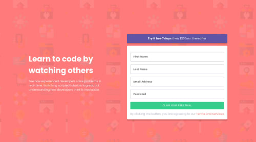
Sign Up form built using HTML, CSS, Javascript and Sass
Design comparison
Solution retrospective
Please go through my solution and give suggestions around:
- any bug in the live site
- accessibility issues in HTML
- issues in the approach of writing Sass (as I have used Sass very 1st time!)
- and any other constructive feedback.
Community feedback
- @pikapikamartPosted about 3 years ago
Hey, awesome work on this one. Layout in desktop looks fine, the form is just little shorter than the original, site is responsive and the mobile state looks great.
Some suggestions would be:
- Always have a
main
element to wrap the main content of your page. On this one, the.content-container
should be using themain
instead ofdiv
. - You don't need
padding
to center the content of.content-container
, remove thepadding
and just addmin-height: 100vh
and let theflexbox
center it properly. - To be honest, it would better if the error-messages are only shown when the form is submitted instead of using
keyup
event because you only want to show the errors if you submitted the form incorrectly , because right now, just focusing on theinput
then using like abackspace
without text, error is already being shows. - Each
input
needs to have alabel
associated to it, thelabel
would be a screen-reader only text, defining what theinput
needs to have. - Error-messages should have an
id
attribute since it will be referenced by theinput
if the input is wrong. - Each
input
should be usingaria-invalid="true"
if theinput
is wrong as well. A pseudocode looks like this:
if ( input is wrong ) input.setAttribute("aria-invalid", "true"); input.setAttribute("aria-describedBy", id of the error-message); else input.removeAttribute("aria-invalid"); input.removeAttribute("aria-describedBy");
By doing this, your user will know that the
input
is wrong because ofaria-invalid
and they will know what kind of error they made because of thearia-describedBy
.- Here is a sample form snippet that I have. Lookup the markup and the js used in here, it is accessible and take note of the structure and attributes addition. You will also see a usage of
aria-live
in here that announces if a form is successfully submitted or if there is an error on the form. button
should have usetype="submit"
be specific on how yourbutton
will act especially when it is inside aform
.- Adding a
cursor: pointer
to thebutton
in desktop layout would be great.
Aside from those ,great work again on this one and if you have any queries just drop it here okay.
0 - Always have a
- @Al-Baraa-BakriPosted about 3 years ago
Good Job :) I think there is no need to scroll on big screens.. More Smooth without this scroll .. And You Need To Fix ACCESSIBILITY ISSUES By use Landmarks. Keep Coding :)
0
Please log in to post a comment
Log in with GitHubJoin our Discord community
Join thousands of Frontend Mentor community members taking the challenges, sharing resources, helping each other, and chatting about all things front-end!
Join our Discord