Design comparison
Solution retrospective
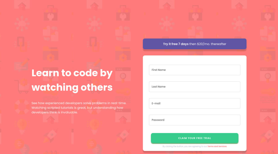
Added e-mail validation. Feedback is welcomed :)
Community feedback
- @devmor-jPosted about 3 years ago
Hey, great job looks good ✨. I suggest make some hover effects to bring some life to it, especially primary button usually informs user by some kind of color change, opacity or something. There are some minor differences like extra shadow on green button, also margin top needs to be adjusted so that whole content is centered. I hope these helps as I said earlier looks fine to me and just shared my thought (no offence) 😅
0 - @shashreesamuelPosted about 3 years ago
Hey good job completing this challenge
Keep up the good work
Your solution looks great however I think both the form and the content has a bit too much margin from the top.
Secondly the terms and conditions below the form's submit button need some margin from the top using
margin-top.I hope this helps
Cheers Happy coding 👍
0
Please log in to post a comment
Log in with GitHubJoin our Discord community
Join thousands of Frontend Mentor community members taking the challenges, sharing resources, helping each other, and chatting about all things front-end!
Join our Discord
