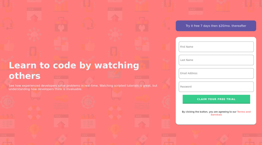
Design comparison
SolutionDesign
Solution retrospective
What are some things that I could do better code wise? How can I get my design to match the mockup more closely.
Community feedback
- @TechNechPosted about 3 years ago
- In your
.trailContaineraddwidth: 65%; .rightContainerandtextContaineraddflex:1to both.- Also add
display: flex;flex-direction: column;align-items: flex-start;properties to.rightContainer
This will fix your issue on larger screens.
Cheers! Happy Coding!! :)
Marked as helpful1 - In your
Please log in to post a comment
Log in with GitHubJoin our Discord community
Join thousands of Frontend Mentor community members taking the challenges, sharing resources, helping each other, and chatting about all things front-end!
Join our Discord
