

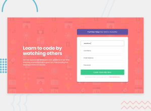
Design comparison

Solution retrospective
Hello everyone,
I would like some advice on how to do this challenge please. How did you manage to maintain the gap between the inputs when the error message appears? Any other constructive comments are of course welcome
Good coding !
Community feedback
- @PPechmannPosted about 2 years ago
Hi Demy!
Congratulations on the solution, looks very nice!
Regarding the error messages resizing the margins: I recommend placing the errors in a
smalltag and giving it aposition: absoluteto take it out of the html flow. Same with the positioning for the error icons.I also suggest applying a css reset to your projects, to avoid (like in this case) an unwated margin or padding on the
body, as many elements have some default stylings. Here you will find a reset I usually use.Looking forward to see more of your solutions!
Happy Coding :)
Patrick
Marked as helpful0@DemyttenaerePosted about 2 years ago@PPechmann
Hi Patrick!
Thanks for your answer! All right, I've noted the absolute position regarding the message and the error icon.
Great! I never thought of using the css reset, now I'll use it!
Thanks again for your advice and help!
Good coding!
1

Please log in to post a comment
Log in with GitHubJoin our Discord community
Join thousands of Frontend Mentor community members taking the challenges, sharing resources, helping each other, and chatting about all things front-end!
Join our Discord