Design comparison
Solution retrospective
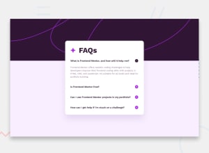
Just submitted a new solution where I utilized JavaScript to show and hide content properly:)
Although, I'm having a hard time with the pattern images, can't send to back them behind the main container... Can someone help me to solve this? Thanks!
Community feedback
- Account deleted
Hi, good work!
I have a few suggestions; you might be interested. Hero image should be stretched on large screen sizes; now that is not the case. Try to resolve that, when the user clicks on a heading, the accordion should be acting like when a button is clicked. Also, try to improve accessibility by adding arias and labels. For the main pattern, you should use a header tag, and the image should be stretched with **width: 100%**and height: auto.
Happy codding! Cheers! :)
0
Please log in to post a comment
Log in with GitHubJoin our Discord community
Join thousands of Frontend Mentor community members taking the challenges, sharing resources, helping each other, and chatting about all things front-end!
Join our Discord
