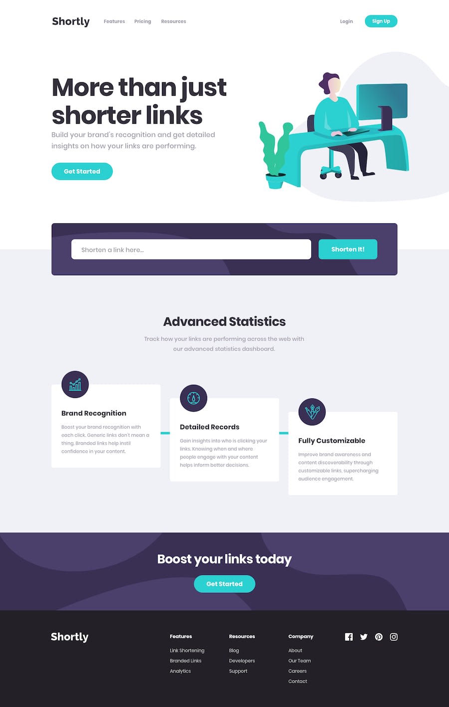
Design comparison
Solution retrospective
I am not sure I made the styles corectly, and if anyone has an idea how I could reduce the amount of code to write, please let me know.
Community feedback
- @akpekigPosted over 1 year ago
To reduce the amount of code in the CSS file, you can import the original reset file in
index.html:<link rel="stylesheet" href="https://unpkg.com/modern-css-reset/dist/reset.min.css" />You also don't need to turn the font-family into a variable seeing as the entire design only uses one:
body {
min-height: 100vh;
font-family: 'Poppins', sans-serif;
overflow-x: hidden;
}
Try to minimise the classes by finding redundancies and turning them into classes that can be shared by elements. I.e.,
.textBoxand.trySectionboth use these lines:flex-direction: column; justify-content: center; align-items: center;Instead of typing this twice, create a third class:
.flex-col-center {
display: flex;
flex-direction: column;
justify-content: center;
align-items: center;
}
and use it both elements:
<div class="flex-col-center">...</div>
...
<section class="flex-col-center trySection">...</section>
Marked as helpful1
Please log in to post a comment
Log in with GitHubJoin our Discord community
Join thousands of Frontend Mentor community members taking the challenges, sharing resources, helping each other, and chatting about all things front-end!
Join our Discord
