Submitted almost 3 years ago
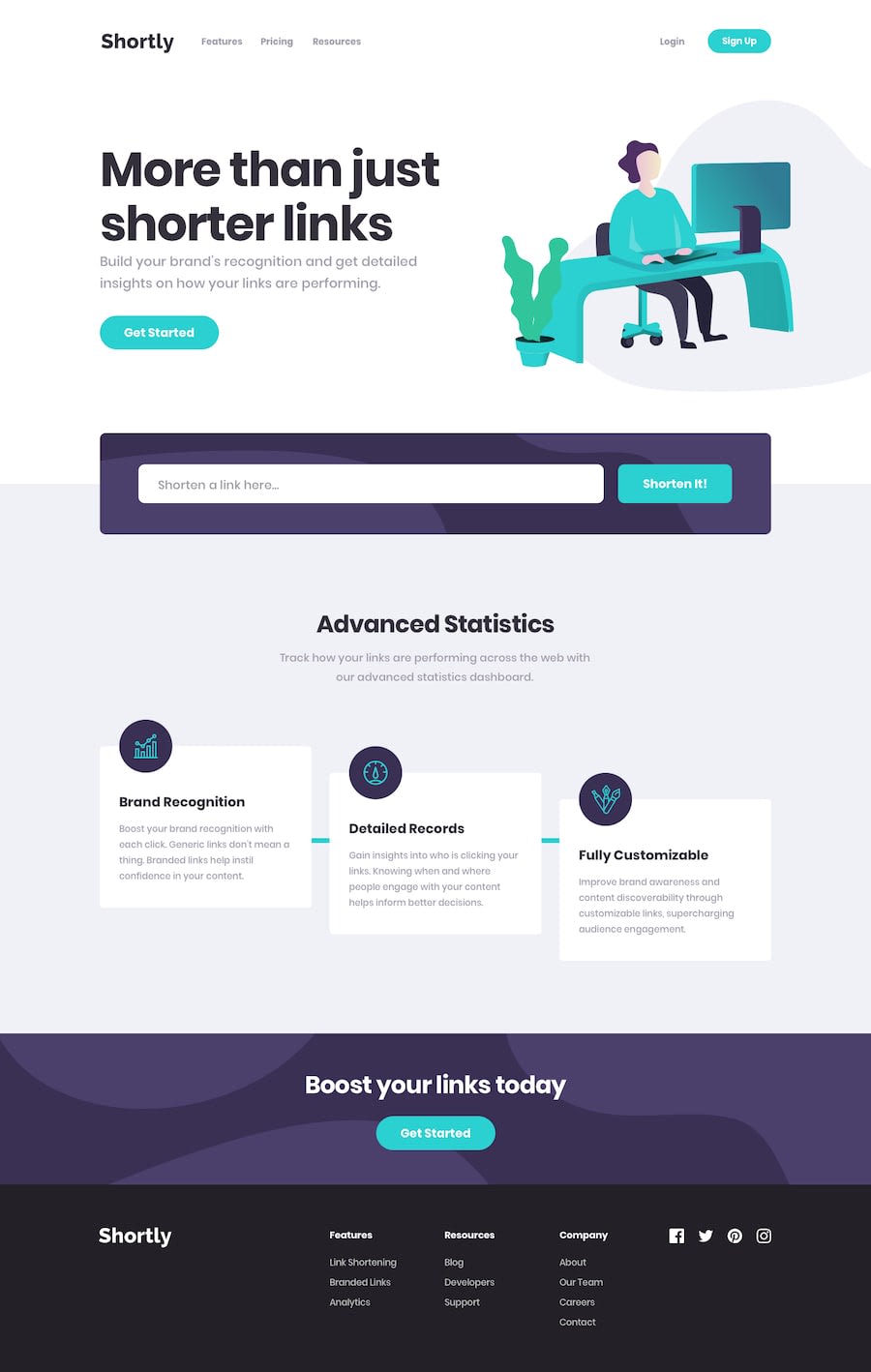
Shortly: URL Shortener using React/Typescript/HTML/CSS
#accessibility#fetch#react#typescript#node
@cbserra
Design comparison
SolutionDesign
Solution retrospective
- I'm not a fan of how I designed ShortenedSection.tsx -- I think there's too much going on. The Form could probably be in its own component, along with the REST calls to the API. I got a little too deep into the weeds with the error handling and CSS.
- A few things I noticed while testing the responsiveness of the application:
- If starting in desktop mode, and resizing the window so that it would trigger the mobile media query, sometimes the Hamburger component would not load -- but I mostly only found this to be a problem locally. I think I read something about React running in strict mode locally, and it either not reloading components or reloading them too often?
- Also, going from desktop to mobile would then trigger the Menu to appear -- which normally only will show/hide when clicking the Hamburger. This likely could have been solved having a separate Desktop Menu from a Mobile Menu, but I was trying to reduce redundancy. I then attempted to add a scroll trigger, so that the menu would disappear when a user scrolls down the page. It seems to work sporadically.
Any feedback would be appreciated! Especially best practices around React. I want to look into CSS post processors to clean up my rules.
Community feedback
Please log in to post a comment
Log in with GitHubJoin our Discord community
Join thousands of Frontend Mentor community members taking the challenges, sharing resources, helping each other, and chatting about all things front-end!
Join our Discord
