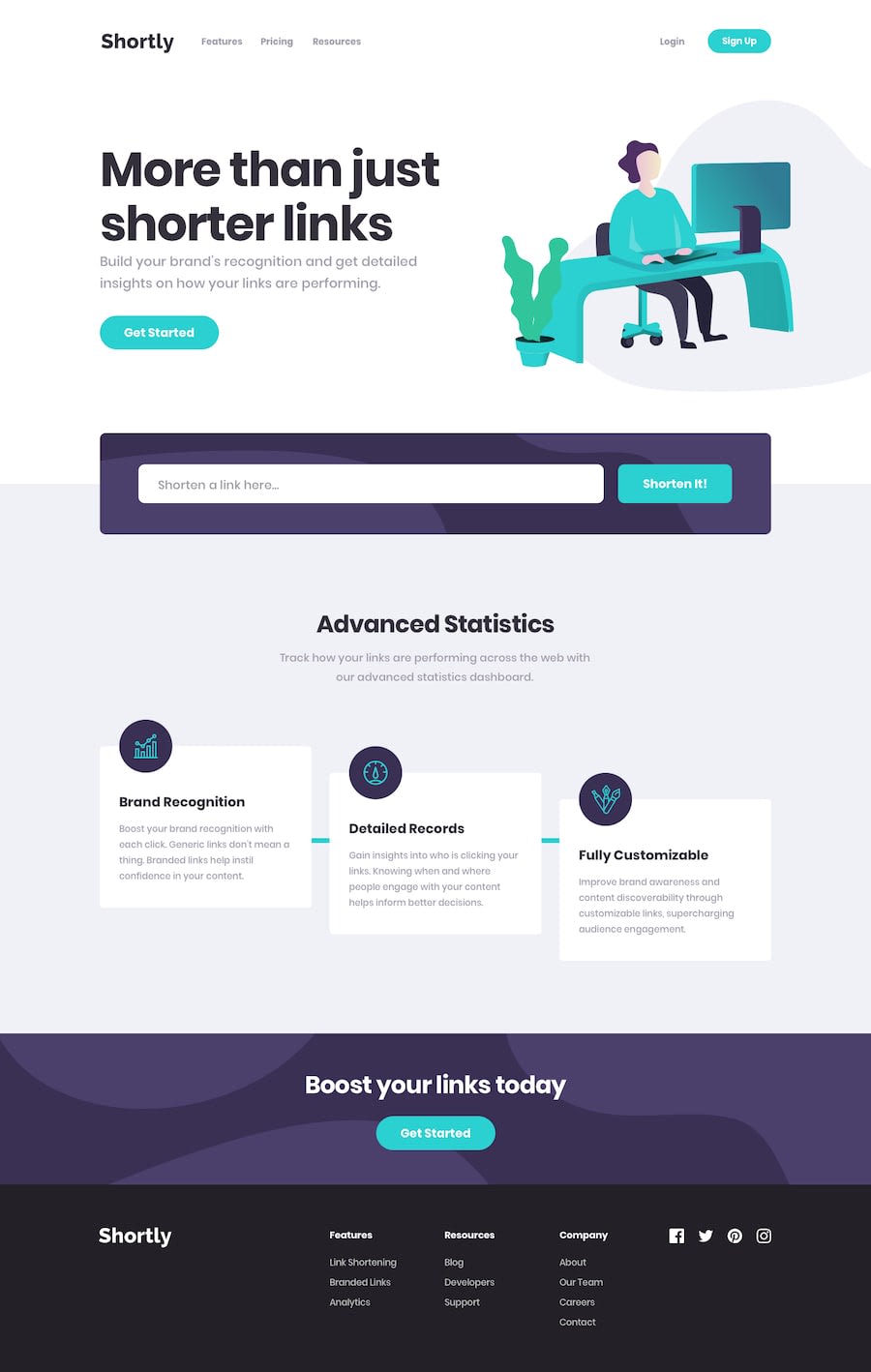
Shortly - React Typescript Sass (Vite app)
Design comparison
Community feedback
- @mako542bPosted almost 2 years ago
Hi. I noticed one small bug prone line in the code - when assigning id's to the link elements, it depends on the length of array with links, but if you delete some older link and then add new one, the last two elements have the same id - it's bad for react rendering (as id's are used as keys) and also if one is deleted, both disappears. In my solution i used the 'code' coming with the api response - i assume it's unique.
Regarding the layout - it looks great for the dimension key dimensions for mobile and desktop, but between there are some elements overlaping, so it could need some some breakpoints
Marked as helpful0@YanivWein24Posted almost 2 years agoHi @mako542b, thanks for the feedback! You are absolutely right regarding the ID issue, I changed the id property to accept the 'code' from the API response (as you suggested). as for the layout, I tried to make it as close as possible to the given design, but I suppose there is room for improvement for different widths.
0
Please log in to post a comment
Log in with GitHubJoin our Discord community
Join thousands of Frontend Mentor community members taking the challenges, sharing resources, helping each other, and chatting about all things front-end!
Join our Discord
