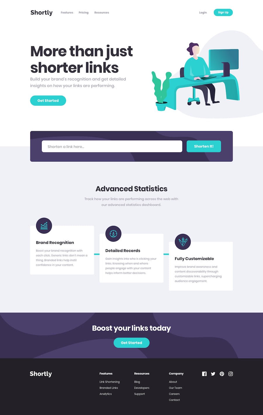
Design comparison
Solution retrospective
Its kind of slow but it works. Please give me feedback
Community feedback
- @MojtabaMosaviPosted almost 3 years ago
1- Find out why it's slow and fix it.
2- the social Icons are not tab accessible, they should acessible by keyboard otherwise user who use the keyboard to nevigate the site can not access them.
3- The font sizes need be to be scaled down a bit because currently they are displayed overly big.
4- Testing properly is good skill that takes time to develop and regardless of how testing you do there is going to always be something that you miss. Try to resize you solution is chrom's developer mode and see how the layout out and disply of element changes as you resize.
5- Providing text alternative for image elements is tricky often times but a simple question that you can ask youself when do is, would any information be lost if you omit ? if the answer is yes that you need to provide the text alternative but if the answer is not the image is purely decorative and you can leave the alt attribute empty. I think the latter case applies to the here image.
Keep coding :=)
Marked as helpful2 - @Elir-MahadPosted almost 3 years ago
Keep up the good work.
First step, fix the accessibility and html issues that were highlighted in the report !!
Marked as helpful1
Please log in to post a comment
Log in with GitHubJoin our Discord community
Join thousands of Frontend Mentor community members taking the challenges, sharing resources, helping each other, and chatting about all things front-end!
Join our Discord

