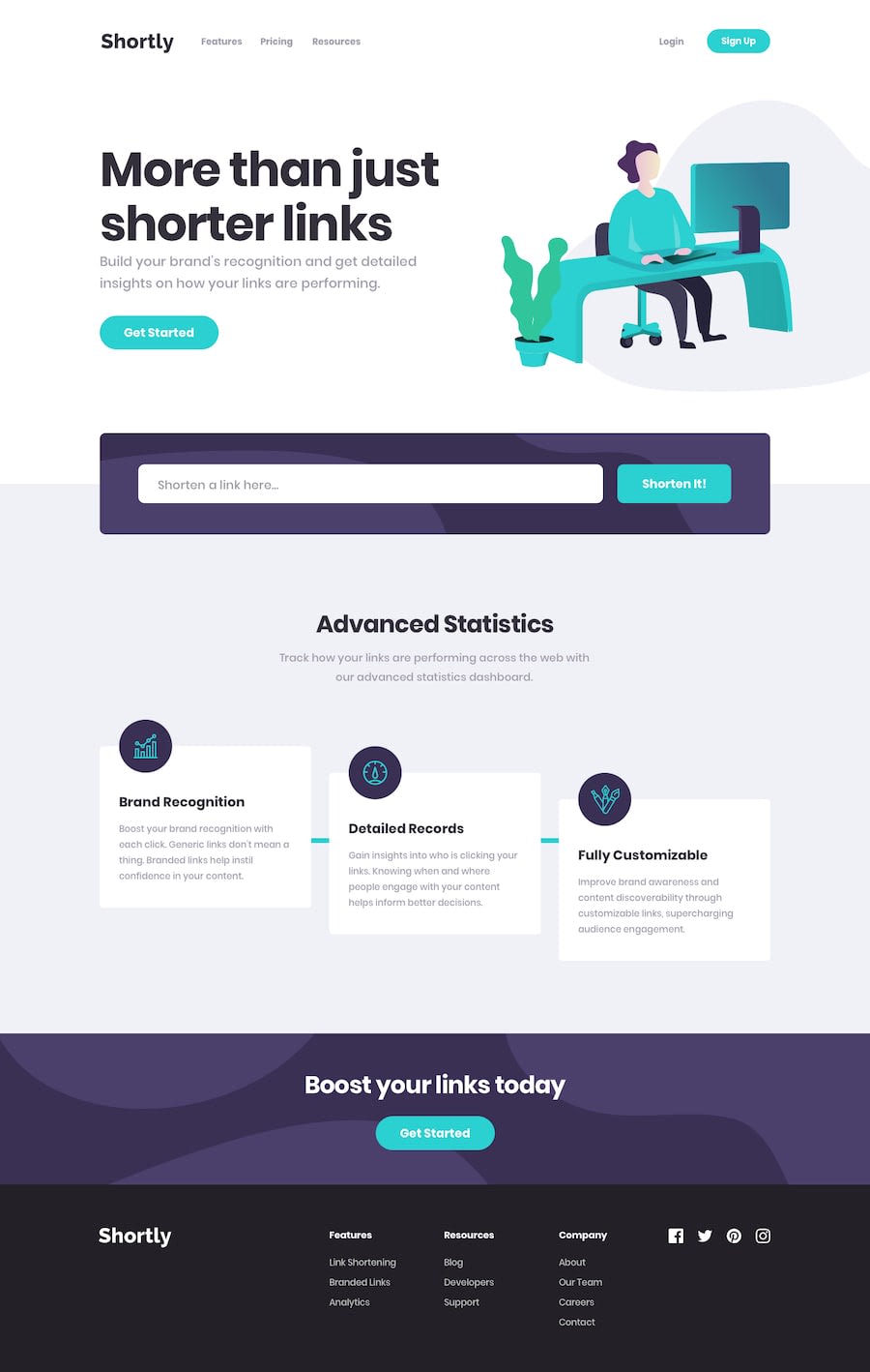
Design comparison
Solution retrospective
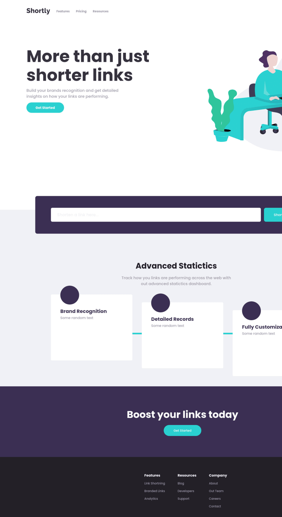
Hi FEM, This was my take at this shortly challenge, I only did the frontend of it to work on my FE skills. I used TS, next, and styled-components to make this webpage.
I struggled with positioning the image so it can be clipped a bit, formatting the code properly, and making it look more like the website with the little details such as the font size and weight, etc. I have not made it responsive and am only working on my desktop right now.
Any advice, especially about doing what I did in an easier way, formatting my code better, or tips on how to style it better and more like the design, would be invaluable.
Thanks to FEM for giving us such amazing designs and allowing us web devs to practice out skills for free, aDev😁
Community feedback
- @2peaglesPosted almost 2 years ago
I do agree I just finished this challenge as well the omg is a bit tricky at the top, but if you put a
left:px;that should work. Hope it's helpful.0
Please log in to post a comment
Log in with GitHubJoin our Discord community
Join thousands of Frontend Mentor community members taking the challenges, sharing resources, helping each other, and chatting about all things front-end!
Join our Discord
