Design comparison
SolutionDesign
Solution retrospective
What challenges did you encounter, and how did you overcome them?
none
Community feedback
- @MizanSafinPosted about 1 month ago
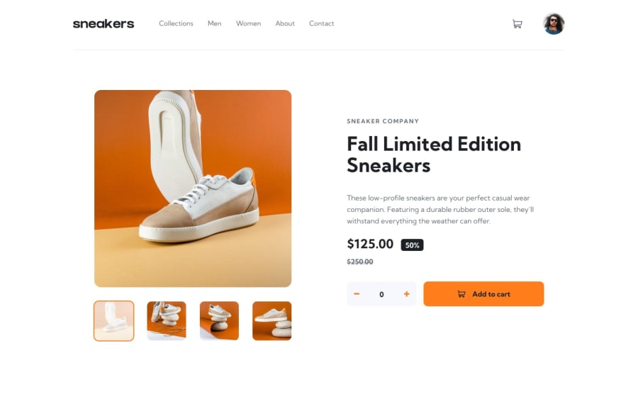
Fantastic design to me .Very close to the original design & additionally you have added dark mode button .I think Just few things missing here like -most probably you didn,t add lightbox when clicking display image.
Marked as helpful1@dvelatcodesPosted about 1 month ago@MizanSafin thank you so much. I will work on the lightbox feature
0
Please log in to post a comment
Log in with GitHubJoin our Discord community
Join thousands of Frontend Mentor community members taking the challenges, sharing resources, helping each other, and chatting about all things front-end!
Join our Discord
