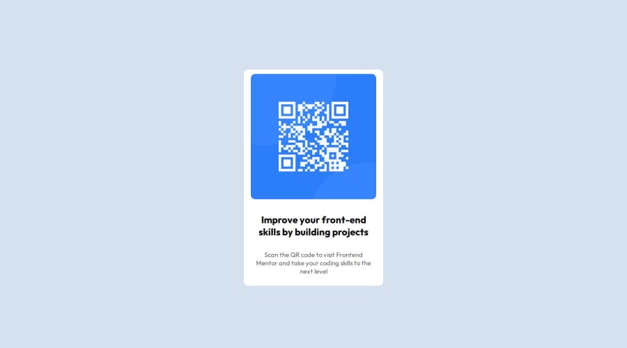
Design comparison
Solution retrospective
I am most proud of downloading and learning SASS to build this application. I am also proud of myself for relearning git/github. Finally, I'm proud of myself for attempting to follow the workflow that front end mentors suggested. It's given me a systematic way to approach front end development.
I would be more strict with the application of the workflow.
What challenges did you encounter, and how did you overcome them?The challenge that I face is my own frustration that I feel when things aren't "pixel perfect". I also faced a challenge of installing SASS. I struggled to utilize it when installing it in my Windows PATH, but I switched to using the "Live SASS Compiler" extension on VS code.
What specific areas of your project would you like help with?I would like help with project management. I would like help in better developing workflows to systematically complete projects.
Community feedback
- @CecDorWEBPosted 9 months ago
Hello, Congratulations on your solution !
Things you could improve ✍️:
- Use the font indicated in the style guide with the link to go to the web site. It's possible to use <link> or @import to retrieve the font.
- Try using semantic HTML elements like main, section and article.
- I suggest using clear descriptive CSS classes like .card, .card-title and .card-description.
Happy coding! 😎
Marked as helpful1@clarkjr2016Posted 9 months ago@CecDorWEB I've updated this project with your suggestions. This was very insightful feedback and I appreciate you taking the time to review my code.
You're suggestions on the semantic HTML was spot on. I missed that on the first go but it was fairly easy to correct after reviewing!
0
Please log in to post a comment
Log in with GitHubJoin our Discord community
Join thousands of Frontend Mentor community members taking the challenges, sharing resources, helping each other, and chatting about all things front-end!
Join our Discord
