Submitted 5 months ago
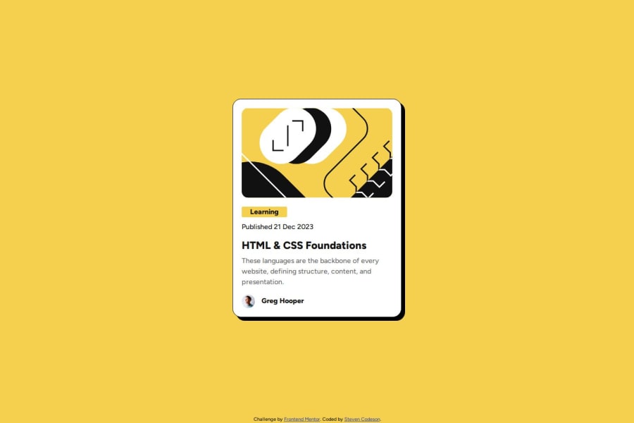
Semi responsive blog preview with bootstrap
#bootstrap
@StevenCodeson
Design comparison
SolutionDesign
Solution retrospective
What are you most proud of, and what would you do differently next time?
Learnt about bootstraps card class. Was able to visualise how the pieces went together before starting. It looks pretty close to the spec. Would like to have a better understanding about when to apply the grid system with bootstrap.
What challenges did you encounter, and how did you overcome them?Struggled to get the card body layout looking spot on.
What specific areas of your project would you like help with?More ergonomic use of layouts, rather than fudging margins until it looks right, I feel I'm missing a big picture concept.
Community feedback
Please log in to post a comment
Log in with GitHubJoin our Discord community
Join thousands of Frontend Mentor community members taking the challenges, sharing resources, helping each other, and chatting about all things front-end!
Join our Discord
