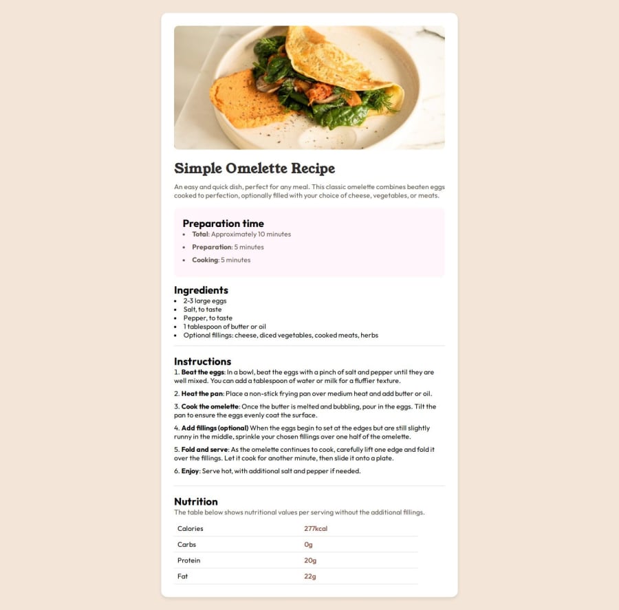
Semantic HTML,Table Formatting, CSS3, Responsive Design
Design comparison
Solution retrospective
I recently worked on a project where I dived into media queries and responsive design, and it was a great learning experience. Here’s what I achieved:
Understanding Media Queries: I got the hang of media queries, which are super useful for making sure my website looks good on all kinds of devices, from big screens to mobile phones. They let me change the layout and font sizes depending on the screen size.
Using Flexbox for Layouts: I learned about Flexbox, which is like a magic tool for organizing and aligning things on a webpage. It helped me make sure everything stays in place and looks neat, no matter how big or small the screen is.
Managing Nested Containers: I figured out how to control small boxes inside bigger boxes on my webpage. This is important for keeping everything organized and making the design reusable.
Making Text Responsive: I discovered how to use rem and em units to make the text size adjust automatically to different devices. This way, the text is always readable and looks good.
What challenges did you encounter, and how did you overcome them?When I worked on my recent project, one of the main challenges I encountered was mastering media queries. Initially, it was tricky to understand how to write media queries that correctly adjust the layout for different screen sizes. I struggled with making sure that elements didn’t overlap or look out of place on smaller screens.
What specific areas of your project would you like help with?As a beginner eager to improve my web development skills, there are a few specific areas in my project where I could really use some help:
1. Refining Media QueriesI’ve started using media queries to make my design responsive, but I’m struggling with how to set effective breakpoints and styles for different screen sizes. Sometimes, the layout doesn’t look quite right on certain devices. Could you provide tips on best practices for writing media queries and choosing breakpoints? Any advice on common pitfalls to avoid would be greatly appreciated!
2. Handling Nested ContainersI’m learning to control small containers inside bigger ones, but sometimes they don’t behave as I want. For instance, adjusting padding and margins can be confusing, and it’s hard to keep the layout neat. What are some techniques or best practices for managing nested containers effectively?
3. Making Typography ResponsiveI’m trying to use rem and em units to make my text responsive, but I’m not sure if I’m doing it right. The text sometimes looks too big or too small on different devices. How do you approach setting up a responsive typography system? Any guidelines for choosing the right units and base sizes?
I’m still figuring out the best way to test my design on various devices and catch issues. What are some effective strategies or tools for testing responsive designs? How do you ensure your layout works well across different screen resolutions and browsers?
5. CSS Maintenance with VariablesI’ve started using CSS variables to manage colors and styles, but I’m not sure if I’m organizing them correctly. How do you effectively use CSS variables for maintaining a scalable and manageable stylesheet? Any tips on organizing and naming them would be helpful!
I’m really excited to learn from your experience and improve my skills in these areas. Your feedback and suggestions will be incredibly valuable as I continue working on my project. Thank you in advance for your help!
Community feedback
Please log in to post a comment
Log in with GitHubJoin our Discord community
Join thousands of Frontend Mentor community members taking the challenges, sharing resources, helping each other, and chatting about all things front-end!
Join our Discord
