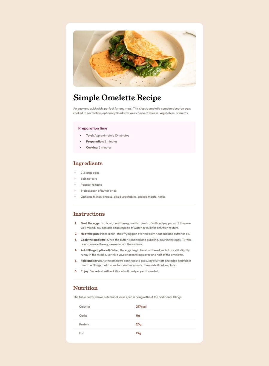
Semantic HTML5 markup, Mobile-first, Grid, Flexbox, CSS variables
Design comparison
Solution retrospective
I have learned so many new things from this project, example :- how can we create a vertical header cells table and make it accessible, how can we create custom bullet points (for ul) and create custom number list (for ol) that I can style as I like, about Semantic tags and accessibility.
So I am very proud of that I have learned so many new things from building this project.
Next time I will ask my self more questions. example:- In which tag I should wrap this text, what is the purpose of this button or this text etc.
What challenges did you encounter, and how did you overcome them?-
Naming convention, Its very challenging to figure out what should I name classes, CSS variables.
-
As you can see in this project there are multiple heading so figuring out in which tag I have to wrap which heading (like this heading goes in
h2orh3), Then I read about in which order we should put heading, Analyze some websites with multiple heading (like Wikipedia).
I want a feedback about my html markup have I used correct Semantic at correct pleases (for example my heading is in correct order), and what about my naming convention and how can I improve naming classes, CSS variables.
thanks for your help.
Community feedback
Please log in to post a comment
Log in with GitHubJoin our Discord community
Join thousands of Frontend Mentor community members taking the challenges, sharing resources, helping each other, and chatting about all things front-end!
Join our Discord
