Semantic HTML5 markup, CSS3, CSS GRID, Flexbox, SASS,
Design comparison
Solution retrospective
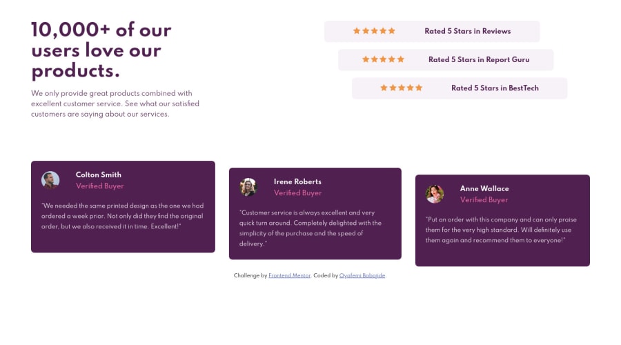
I further improved my skills with CSS Grid and SASS. I will like your comments on what I could have done better. Regards.
Community feedback
- @pikapikamartPosted about 3 years ago
Hey, awesome work on this one. Layout in desktop looks great though the site is not responsive at the moment. Before submitting or just coding in general, first, as I would prefer start from mobile first approach and after coding the mobile of a section, change the screen-width and work your way up to desktop layout. That way, you will be able to see on how your site looks when the screen-size changes. Mobile layout breakpoint is too late, you are using 375px which is too small for other phones, using mobile first approach you will fix issues like this.
Other suggestions would be:
- Always have a
mainelement to wrap the main content of your page. On this one, the.entire-componentshould be using themaininstead ofdiv. - The bold text on the left side should be using
h1. Remember that a page must have a singleh1. - Don't use
figureon the stars since they are just purely decoration and doesn't really have afigcaption. What I would do is that, use them asbackground-imageremember that you can put any amount of images on thebackgroundprop, this way , you avoided using extra html tags. - Also
figcaptionmust be insidefigure. - Person's
imgshould be using the person's name as thealtlikealt=" Colton Smith". A component like this when a person's name and image are both present, use the person's name as the value as it is a meaningful image. - Since you are using
figureon the testimonial, the person's name could usefigcaption. - The person's name as well should be a heading tag since they are the main point for each testimonial. You can use
blockquoteas well. - Lastly, making the site more responsive and the mobile breakpoint to be adjusted.
Aside from those, great work again on this one.
Marked as helpful1 - Always have a
- @Babajide777Posted about 3 years ago
@pikamart Thanks for your in-depth feedback. I did use a mobile-first approach, but I want to work with only 2 breakpoints for now. I will increase the first breakpoint to about 475px for other projects as you advised. I plan to use 3, 4, or 5 breakpoints when I get to more complex projects like landing pages. I really appreciate you taking the time to look at my work. Regards.
1
Please log in to post a comment
Log in with GitHubJoin our Discord community
Join thousands of Frontend Mentor community members taking the challenges, sharing resources, helping each other, and chatting about all things front-end!
Join our Discord
