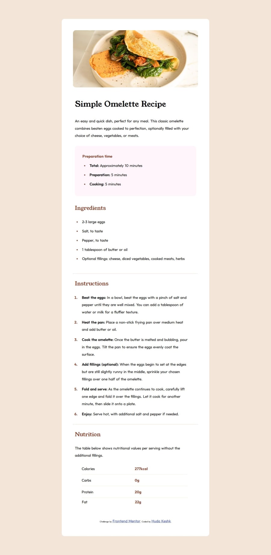
Semantic HTML5 markup, CSS Lists, CSS Table, Media queries.


Design comparison

Solution retrospective
*Reaching such a result after completing both HTML & CSS in around 4 months. *Being able to use responsive layout techniques correctly *Trying to finish the project with the minimum number of classes, using the semantic tags names as selectors.
-- Next time I will try to minimize the codes' lines, and write down the media queries codes in more prettier and shortened yet effective way.
What challenges did you encounter, and how did you overcome them?*Add colorful (hr) between sections. -- I found the answer on StackOverflow website, which was adding a top border with the color you want like in the following code: hr { border-top: 1px solid hsl(30, 54%, 90%); }
*How to use internal fonts after using to add fonts by it's external links. -- First mentioning the font from you project's folder:
Then adding that code in CSS: @font-face { font-family: 'Outfit'; src: url(assets/fonts/outfit/Outfit-VariableFont_wght.ttf); }
*What are the standard dimensions I'm going to use for media queries as screen sizes.. -- I found the solution on Bootstrap website under the section of (Breakpoints) giving the latest dimensions of all usable screens, up to date..
What specific areas of your project would you like help with?I'd like always help with making my code looks more simple and short. Also I'd like to have more help with media queries and moving from query to another smoothly..
Community feedback
- P@StroudyPosted 7 months ago
Some more feedback, I had a look you haven't got any resets in place we use these to make it easier to style. A Modern CSS Reset, to make your site responsive use EM or REM is most cases. Keep going and keep learning
Marked as helpful1 - @TedJenklerPosted 7 months ago
Hi @H-Keshk,
Nice project! I noticed that your site isn't fully responsive. I would strongly recommend looking into the mobile-first approach. Think of your project like a building, where the desktop view is the top floor. By making the mobile view stable and good, you can then expand the spacing to make your site fully responsive. This approach helps avoid the issue of adding numerous media queries to fix a "broken basement."
Here are a few more tips:
Use REM Instead of PX: It's generally better to use rem units instead of px. You can easily convert px to rem using a converter tool or by using ChatGPT to assist with the translation. Save the chat and be specific in asking it to translate px to rem without altering the code.
Avoid Fixed Widths: Whenever possible, avoid setting fixed widths. Instead, use min-width or max-width to create fluid layouts that adjust more gracefully to different screen sizes.
I hope these suggestions help improve your project!
Best, Teodor
Marked as helpful1@H-KeshkPosted 7 months agoThose advices are very useful and I'll consider them in the upcoming projects, Thanks sooooo much ♥ @TedJenkler
1 - @ARiYaNSEp0-0Posted 7 months ago
Hello @H-Keshk. great job on this recipe page challenge. if you fix spacing like padding and margin your result get closer to design and also don't manually add vendor prefixes yourself use a postcss plugin "autoprefixer" this would add vendor prefixes for you.
Marked as helpful1 - @Jani-BPosted 7 months ago
Looks good.
I like the good commenting on the CSS. That is something I very often forget to do. It looked very good.
- I noticed that you forgot to change the width 55% for the media query 576px version. for the extra small just make the width something like 100% and everything should work just fine.
It will also help you if you make the general layout mobile first. -> start doing the css for the mobile size. and then change it with media query for bigger screens. This way there is lot less problems as it is easier to adapt to the growing screen size than to screen size that gets smaller.
I hope this helps :) Your solution is very nice !
Marked as helpful1@H-KeshkPosted 7 months agothanks a lot, your comments are very encouraging, I were so terrifying as it's my first project here, but your comments are very respectful, Thanks ♥ @Jani-B
0


Please log in to post a comment
Log in with GitHub
Join our Discord community
Join thousands of Frontend Mentor community members taking the challenges, sharing resources, helping each other, and chatting about all things front-end!
Join our Discord