Semantic HTML5, markup CSS custom properties, Flexbox
Design comparison
Solution retrospective
What did you find difficult while building the project?
- Doing the image hover overlay was a bit difficult
- Making my effect stick to the area I want was difficult
Community feedback
- @PhoenixDev22Posted about 2 years ago
Hello Ajanaku Ifeoluwa,
Excellent work! I have some suggestions regarding your solution:
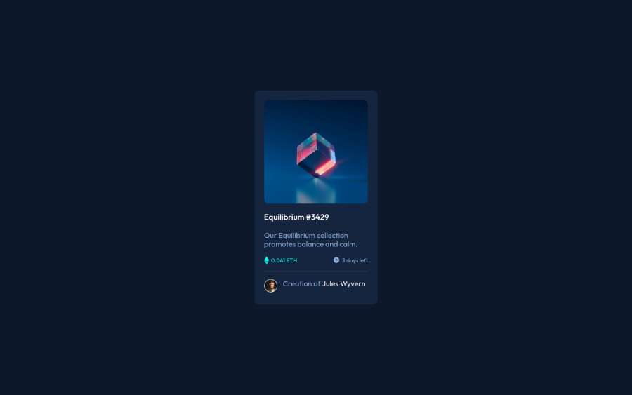
- The most important part in this challenge is the interactive element. Since there's a :hover state on the image and means it's interactive, So there should be an interactive element around it. When you create a component that could be interacted with a user , always remember to include interactive elements like(button, textarea,input, ...) For this imagine what would happen when you click on the image, there are two possible ways:
1: If clicking the image would show a popup where the user can see the full NFT, here you use
<button>
.2: If clicking the image would navigate the user to another page to see the NFT, here use
<a>
.- You should have used
<a>
to wrapEquilibrium #3429
andJules Wyvern
too.
- The link wrapping the equilibrium image (
image-equilibrium
) should either haveSr-only
text, anaria-label
or alt attribute text that indicates where the link navigate the user(not describes the image).
- Images must have alt attribute.
- For any decorative images, each img tag should have empty
alt=""
and addaria-hidden="true"
attributes to make all web assistive technologies such as screen reader ignore those images in (icon-view, icon-ethereum, icon-clock
).
- Profile images like that avatar are valuable content. The alternate text of the avatar’s image should not be empty. You can use the creator's name
Jules Wyvern
. Read more how to write an alt text
- There are so many ways to add the hover effect on the image , The one I would use, using pseudo-elements to change the teal bg color to a hsla. Then opacity can be changed from 0 to 1 on the pseudo element on hover. There is no need for a extra clutter in the HTML. The icon view does not really need to be in HTML. You can use CSS for it.
- There are a lot the arguments against the 62.5% font size trick ,it state that you should never change the root font size because it harms accessibility.
- There is a little gap under the image, You can set
display: block;
to the image.
- Remember a css reset on every project. That will do things like set the images to display block and make all browsers display elements the same. hopefully this feedback helps.
Marked as helpful0 - @correlucasPosted about 2 years ago
👾Hello Ajanaku Ifeoluwa, congratulations for your new solution!
Nice solution and nice code! I can see that you paid a lot of attention to your code/design. If you don’t mind I’ve some tips for you:
1.To make your solution even better and more responsive, you can create a media query to break the elements in the
pricing section
afterwidth: 350px
and make every content in a different row, saving space for low resolution devices.@media (max-width: 350px) { .second-p { display: flex; justify-content: space-between; flex-direction: column; }
2.Add a margin of around
margin: 20px
to avoid the card touching the screen edges while it scales down..3Add transitions to make smoother the interaction while the element gets hovered, you can use a value like
transition: all ease-in 0.5s
.✌️ I hope this helps you and happy coding!
0
Please log in to post a comment
Log in with GitHubJoin our Discord community
Join thousands of Frontend Mentor community members taking the challenges, sharing resources, helping each other, and chatting about all things front-end!
Join our Discord