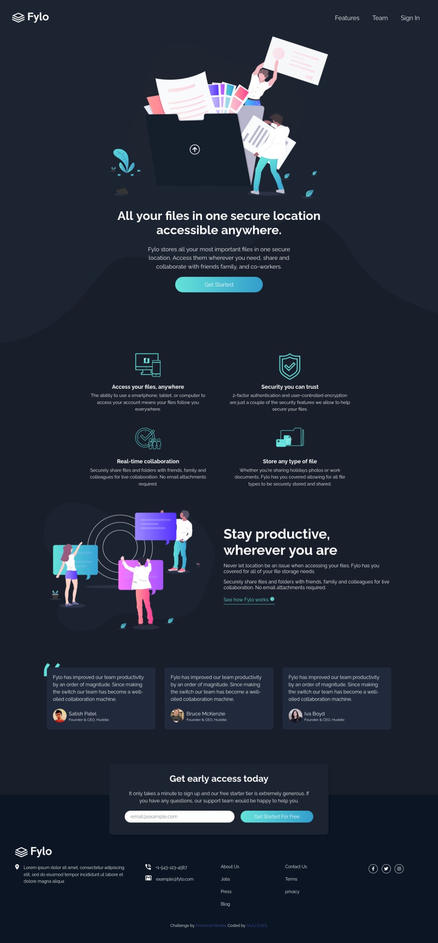
Semantic HTML5 markup, CSS custom properties, Flexbox and JS
Design comparison
Solution retrospective
Critic
Community feedback
- @DavidMorgadePosted about 2 years ago
Hello Ajagun Samuel, congrats on finishing the challenge, great job!
If you don't mind I would like to give you some suggestions.
I would personally change a bit the html structure, instead of having a big header, I would only have your logo and the navbar inside the
header, and then the rest of the content (the hero image and the rest of the sections), inside themaintag, separated in semanticallysectiontags, then every testimonial inside anarticletag.For the CSS it seems that you did pretty good, the only thing I would change is the
main-bottom-flexto column on a higher width (maybe like 768pixels?) but this is just a personal opinion, don't forget to add on hover effects to your buttons for a better user experience. Adding some transitions to does hover effects would make them even better!Apart from that, great job, hope my feedback helps you in your future projects!
0
Please log in to post a comment
Log in with GitHubJoin our Discord community
Join thousands of Frontend Mentor community members taking the challenges, sharing resources, helping each other, and chatting about all things front-end!
Join our Discord
