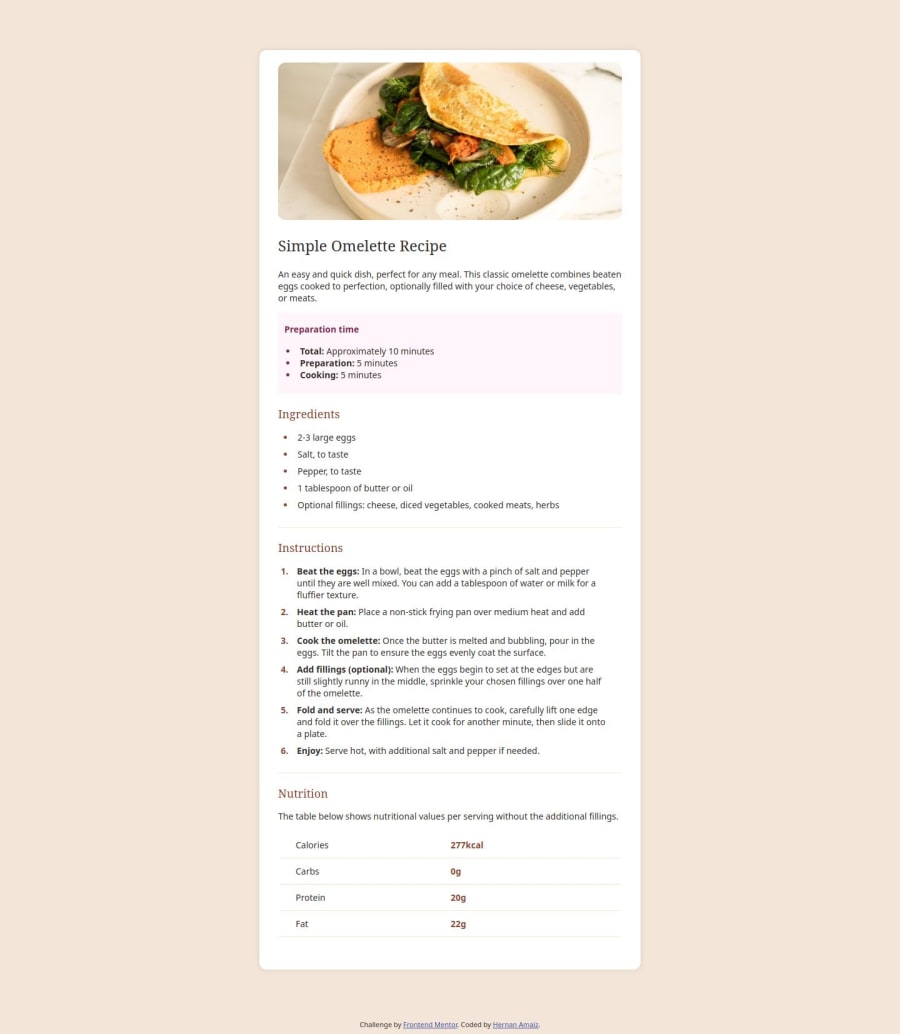
Design comparison
Solution retrospective
I feel fine with my solution. Sería mejor si tuviera acceso a Figma 😅
What challenges did you encounter, and how did you overcome them?The semantics
What specific areas of your project would you like help with?Feedback about the css, how can I do it better.
Community feedback
- @JamesLavironPosted 3 months ago
Hey, since I saw your solution in my feed and saw that you wanted some CSS tips, I decided to take a look at your code.
First of all, it's very good. You've used semantic HTML as much as possible and tried to make it reusable. However, it looks like you're having problems with the fonts, maybe you need to check why it's not working as expected.
As a first step to improving your css, I'd focus on using more reusable and powerful query selectors. Perhaps take a look at some articles on how you create your selectors (spoiler: use classes and IDs :) ). Checking out the BEM methodology can be a great way to understand how CSS and HTML work together.
Nice solution :)
ps: I've just seen that you use the 'px' unit. Avoid using pixels at all costs, it won't work well on many high-resolution screens. Better to use rem/em :)
Marked as helpful1@Maizo21Posted 3 months agoHi @JamesLaviron!
Thanks for the comments. You are absolutely right, I am going to change the CSS and use more classes and also change px to rem/em.
I don't know much about BEM methodology, I'll look it up. Thank you! 😁
0
Please log in to post a comment
Log in with GitHubJoin our Discord community
Join thousands of Frontend Mentor community members taking the challenges, sharing resources, helping each other, and chatting about all things front-end!
Join our Discord