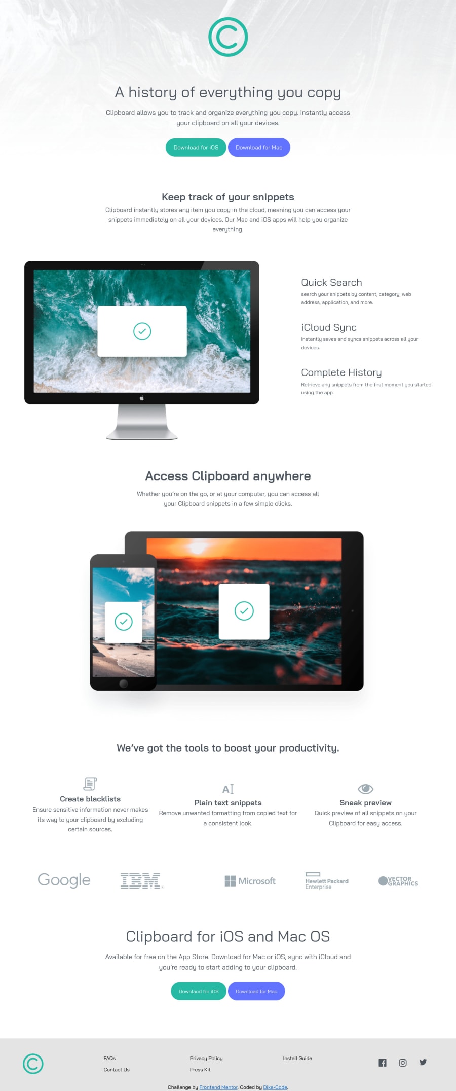
Semantic HTML5 and CSS coupled with Flexbox and Grid)
Design comparison
Solution retrospective
Hi Everyone!! What do you think of my first "FrontendMentor Challenge? Please do well to put down your opinions and suggestions of it... so for me to know what works better and what doesn't.
Community feedback
- @TalhaAmjad0034Posted almost 4 years ago
Seems perfect to me.
0@Dike-CodePosted almost 4 years ago@arywahhh Thank you, I really appreciate.🙌
0 - @jomefavouritePosted almost 4 years ago
Hello Clinton, you did a very good job on your first challenge and here're my suggestions.
-
I noticed that the
sectionelement with the class namesitehas adivelement with an image element with nosrcattribute link which produces an unnecessary space in the layout. I suggest removing thatdivelement. -
Also, I suggest applying a
max-weightproperty to the paragraphpelements in other for the text not to be stretched out on bigger screens. -
Also the images, should have a
max-weightproperty applied. For example:
.device_showcase .device {
    width: 75%;
    max-width: 1000px;
}
The
max-weightproperty prevent the image from growing along with the viewport when that max weight is reached.- Finally, I'll suggest following a much better semantic layout structure. I noticed you didn't include the
mainelement. Well, this is my personal structure though. Example below
<header>...</header> <main>...</main> <footer>...</footer>0@Dike-CodePosted almost 4 years ago@jomefavourite. Thanks a lot... I'd sort and amend the errors.
1 -
- @erickwalker1Posted almost 4 years ago
Wassup man, seems your preview site is rendering a 404. Maybe you mistyped the url?
0
Please log in to post a comment
Log in with GitHubJoin our Discord community
Join thousands of Frontend Mentor community members taking the challenges, sharing resources, helping each other, and chatting about all things front-end!
Join our Discord
