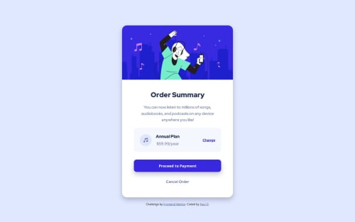
Semantic HTML with responsive CSS

Solution retrospective
A bit more organized in the process of completing the structured HTML code before beginning to write the code to added the CSS styles. Next time, after writing the HTML based on the desktop design, I will begin with a mobile-first design and finish with a media query for changes needed for the desktop design.
What challenges did you encounter, and how did you overcome them?Some colors in the browser display did not match the look in the Figma file even though I'm 99% sure I used the expected color codes provided in the design file. I considered changing the code to match my visual feedback and (after considering it) eventually decided it's better to use the provided color codes rather than visually match the colors to my monitor.
What specific areas of your project would you like help with?I expect it's not a "perfect" solutions but I imagine it's close enough for a "newbie" challenge. ;-)
Please log in to post a comment
Log in with GitHubCommunity feedback
No feedback yet. Be the first to give feedback on Paul Olynek's solution.
Join our Discord community
Join thousands of Frontend Mentor community members taking the challenges, sharing resources, helping each other, and chatting about all things front-end!
Join our Discord