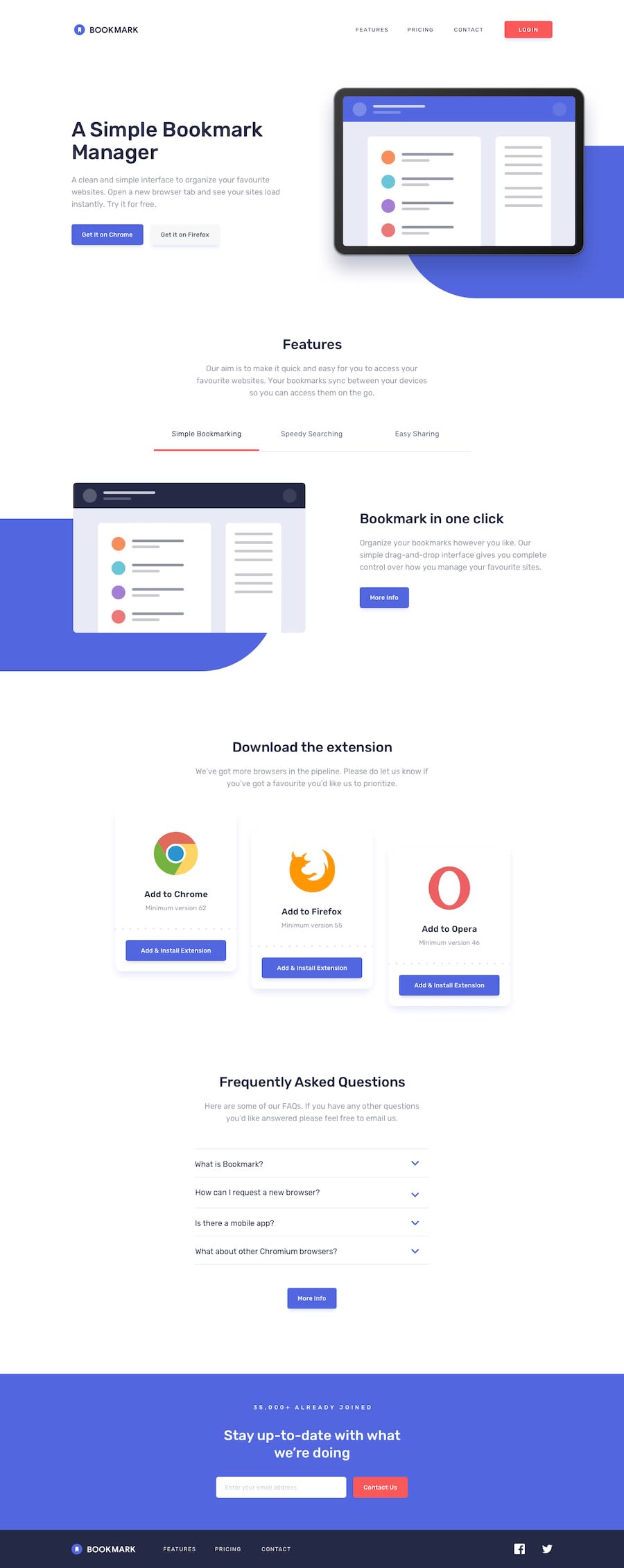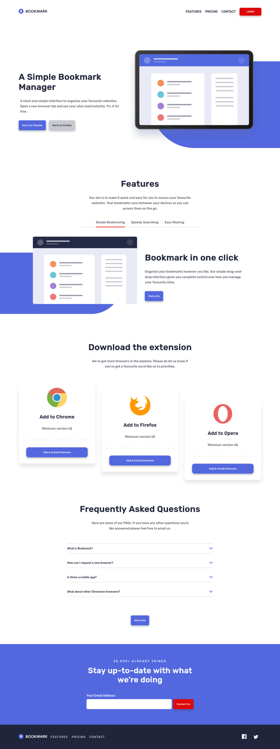
Design comparison
Solution retrospective
I'm having a problem with trapping focus inside the mobile menu, it works fine when navigating with the tab key but it's not working when using shift+tab
I also want to know if the website is good enough to include in my portfolio
feedbacks are welcome
Community feedback
- @pikapikamartPosted about 3 years ago
Hey, great work on this one. Layout in desktop seems a bit wider than the original, on mobile layout it seems fine but some elements are bit wider as well.
Regarding your query, I tried looking in your javascript, but you didn't push the development code in your github, make sure to include them not only the production build so that it would be easier for other to look at it.
Some other suggestions would be:
- The website logo link
a
in theheader
should havearia-label="homepage"
. So that users will know where this link would take them, hence, homepage. - Great job implementing tab interface, though I would implement it by user selecting and not auto selecting when changing the tabs. A suggestion, after the selection, the focus should be on the whole container of that selected tab so that screen reader will announce the whole content and not only the
learn more
link. - The
alt
for the browser could use their name likealt="chrome"
. - On the
add & install extension
I would either have asr-only
span
inside it so that it would be completed likeadd & install extension "to chrome"
. If a user just navigated by links and not by heading. - I wouldn't make the faq question in a heading tag since it doesn't really inform a user that it would be a dropdown.
- I wouldn't as well add each dropdown question as a region, since the
faq
container itself is already the region that holds it, and it will just inform a user that the section itself is important. - Form validation would be really helpful as well, adding the errors and making
aria-live
to inform users if the person successfully submitted the form or if an error has occurred. - On the
footer
I wouldn't add the website logo in thenav
only the 3 links since they are the primary links like on theheader
. Thearia-label
of the website logo link should bearia-label="homepage"
as well. - Hamburger toggler in mobile state needs to have
aria-expanded
.
Aside from those, really really great work. Accessibility is really focused in here, really great job.
Marked as helpful1@Anwar11234Posted about 3 years agoDevelopment code is in another branch in the same repo
Thanks for all these great tips, would work on the homepage link and the footer and the faq section and the toggler
- auto selection for tab interface is considered a best practice
- I think that 'add to chrome' heading does the job so there's no need for alt on the icon, the .sr-only span is a good suggestion though
- I totally forgot about form validation, would work on it
Thanks a lot for these helpful tips and your wonderful feedback. is it good to be included in my portfolio ?
0@pikapikamartPosted about 3 years ago@Anwar11234 I don't know about if it is best practice. I would rather manual select my preferred tab but at least both works.
Also, I think it would be great to add it. This challenge is one my favorite since there are lots of things, especially accessibility coverage on this one that is really good to showcase, showing that you support all people to able to use your website.
0 - The website logo link
- Account deleted
Go into mobile and activate the mobile menu than return to desktop and see what happens.
Keep coding👍.
1
Please log in to post a comment
Log in with GitHubJoin our Discord community
Join thousands of Frontend Mentor community members taking the challenges, sharing resources, helping each other, and chatting about all things front-end!
Join our Discord